
Website Design
2021
Sophinas Beauty Studio
Over one month, I completed a design project for a new beauty studio Sophinas Beauty Studio. The only platform that Sophina used was Instagram, and they gained their clients through word of mouth and referrals. The goal was to provide a platform for clients to view, retrieve information, educate themselves on the services and book appointments and help Sophina communicate its values through branding and transparency.
Roles
Website Design
UX & UI Design
Art Direction
Visual Design
Mockup
Interaction Design
Tools
Figma
Type
Individual
Date
May 2021 to
June 2021
Contributions
I was the lead designer for this project, designed the user experience, and interfaces provided visual design guidance and art direction to the stakeholder. In addition, I presented my design process by regularly communicating with the studio owner to understand better what her business is aiming to do while checking in with the website developer to understand the capabilities of UI Design on their end. I also created a brand identity for Sohpina to communicate feminity, change, and beauty through smooth lines and pink tones.
Overview
Sophina's beauty studio is a beauty salon that offers affordable and professional microblading and permanent makeup services by Sophie. This experienced makeup artist came up with techniques that allow for blending a few services for a more natural result to strengthen the confidence and self-love of individuals looking for a bit of beauty enhancement in their appearance.
Process
01
01
Problem Statemen
Sophina's Beauty Studio provides various professional and affordable beauty services, with an outstanding combination of these services to help enrich individuals' natural beauty and allure.
They didn't have any platform where clients could educate themselves on the services Sophioan provides and get in touch with the studio with ease. The only outlet available was Instagram which provided limited information on services and promotions. This resulted in clients not having the opportunity to get in touch with the salon and learn what these services do and their main differences, which led to them not being able to choose the most suitable services or services for themselves.
Sophina wants their clients to feel confident with the artist and be well informed on the process, thus eventually booking appointments.
02
02
Opportunity
Creating a platform and identity that represented the business goals and values of natural and professional beauty enhancements and built trust by educating clients to help them choose the best services for themselves and understand what they can expect from these services.
03
03
Framing
Based on the opportunity, I framed the problem as follows:
“How can I assist Sophina in communicating their values and services to help clients choose the right services to feel confident to book an appointment?”
Research Process
01
01
Research
I started the project by gathering as much information about Sophina as possible to gain a deep understanding of its goals, customers, and competitors. The initial research process involved auditing competitors' websites, holding meetings with Sophie as the stakeholder, and sending out user surveys to Sophies existing clients.
01
02
03
04
Clients need to understand Sophina's services and their quality clearly.
They want to know what to expect from these services.
Sophina's beauty salon can combine these services in a unique way for each customer.
Customers are looking for a change and a boost of confidence when purchasing these services
They also want to contact the studio and ask questions when needed.
02
02
Competitor Audit
Through researching other permanent makeup competitors, I gained a better understanding of the problem space. By comparing these competitors' websites, I noticed that describing services, providing a FAQ page, and before and after photos were common features. In addition, some websites provided a lot of information, while others kept the websites simple and to the point.

03
03
Interview
I interviewed four people and created an interview discussion guide to help dig deep into the user’s mental model - to understand what is holding those back who are/have considered permanent makeup and what user’s typically want to see when researching.
From this research, these key insights were uncovered:
01
02
03
04
Customers are looking for a change and a boost of confidence
Users want to see what they can expect from each session
Information on services should be effortlessly accessible
Users want to be informed of the entire process
04
04
Persona
While examining early research and insights, it became necessary to identify who the design solution was intended for to better understand customer-client interactions before moving forward.

05
05
Journey Mapping
I conducted a meeting with Sophie and two of her clients to understand this process better, which helped uncover what processes Sophinas clients take when considering this beauty studio for its services. Then I created a document by articulating customers' thought processes and emotions into an understandable journey map.

Art Direction
To help Sohpina communicate its professional and natural beauty enhancement values, I created branding guidelines to help Sohpina be more aligned with its core value of beauty, confidence, and tenderness.
01
01
Moodboard
As a visual representation of critical elements of the Sohpinas Beauty Studio brand, I created a mood board that’s illustrative of Sophinas’s elegant and beauty enhancement values by gathering and grouping images based on the opportunity I identified. I incorporated elements into the brand to convey feelings of femininity, confidence, change, smooth lines, lifestyle, and calmness.

02
02
Styleguide
With the opportunity and framing in mind, the comprehensive style guide establishes an identity for Sophina that reflects aspects of elegance, self-love, natural beauty, and change.
The style guide consists of the defining elements of Sophins's brand, including an overview of Sophinas core values, a color palette, typestyle, image style, and logo usage.
Fonts
For the font, I went with Bodoni 72 for headings which gives an elegant feeling and showcases the flexibility of lines. I also used Avnir for its minimal and modular feeling, which gives a futuristic look to the design. I used Northwell, a handwritten script font that gives a signature look to more prominent names for a more comfortable look.
Colors
For colors, I used gentle tones of pink and neutral gray to maintain a sense of tenderness, calmness, femininity, and love to portray self-love.

I used blobs throughout the website to create an organic look and to add a sense of cohesion, visual continuity, spatial separation, and vertical rhythm. Blobs also help with cropping images in a less predicted way. The soft curvy lines contrast with the blocks of images and direct the eye throughout the information provided while keeping a sense of tenderness.
01
01
Site Map
Based on the research, I structured the hierarchy of information to highlight essential elements by creating a list of necessary features to assess for the design process: About the Service, About the artist, Step by Step Process Outline, Before & After Photos, Services & Pricing, FAQ, Online Booking, Contact Page & Social Media.
Customers are looking for a change and a boost of confidence
Provide testimonials from real clients about their experience with the services
Users want to see what they can expect from each session
Design a gallery page for potential clients to see other clients' journeys through images and visuals
Information on services should be effortlessly accessible
Design for simplicity of information
Users want to be informed of the entire process
Design a process page that explains the entire process of the procedure (FAQ)

01
01
Wireframes
After meeting with Sophie as a stakeholder and the engineer developing this website, I made a few iterations to the site map before moving forward with wireframes mockups. Once we made the final decisions on the information architecture, I moved on to creating low-fidelity wireframes to get a better idea of the flow and layout of the screens.

01
01
Challenge
While creating the wireframes, we struggled with how we could manage the booking and appointment process. Sophie aimed to purchase a booking service similar to Mindbody, where clients would be directed to a different platform to book a service with Sophina. However, she felt that as she is starting a new business, she may be tight on budget and won't be able to use her branding for it.
Also, building an appointment booking page could have led to having multiple and complicated pages within Sophinas's website that could have been complicated for clients.
To do this, I suggested a request to book an appointment feature within the contact page where clients can be informed of the hours of operation and request an appointment based on that and their availability in a few simple steps. First, they provide their name, email, and phone number, choose a potential date that works best for them and write any notes or questions they have. This way, they can connect with Sophie in a few steps, and Sophie then contacts them to answer any questions and provide them with an appointment.
First Iteration
Final Iteration


01
01
Mockups
After the wireframes were finalized, I worked with the developer to implement the website by adding colors, fonts, and images.

Homepage
To be transparent with clients, the home page is meant to be a quick overview of all Sophinas services, Sophie herself as the business owner, before and after images and gallery, and testimonials. Navigating between pages is easy, with Multiple buttons distributed throughout the homepage.

Services
Services are listed with descriptions and images for clients to find the service they'd be interested in. A call to action button next to each service description guides customers to book an appointment after learning about the services. At the bottom of the page, they can view the price range of each service individually, touch-ups, and the combined packages offered. In the end, they can read about some additional information such as deposits and parking that is necessary to know before their visit.

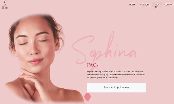
FAQ
The FAQ page provides answers to frequently asked questions customers may have about the services. It aims to educate clients on crucial information such as after and before care, what they need to be aware of, the duration of the service, etc. They can also search for a specific question at the top if they are unwilling to scan through all the information.
The transparent blobs can be seen where they are set rhythmically, acting as a guiding visual element that draws attention to information.
Gallery
The gallery page provides before and after images of the services that have already been done before to help clients understand what to expect from each session visually.

Contact
Contact information is laid out for them to encourage clients to reach out to Sophina and book an appointment. They can read about hours and days of operation and call or email them to contact them.

Website Expected Benefits
An organized, branded website is necessary for Sophina to give potential customers an understanding of Sophina's services. Potential clients will understand that Sophina is a professional beauty studio that offers various beauty enhancement services with natural results to ensure customer satisfaction. Additionally they will be able to contact Sophina to request an
appointment quickly.
Takeaway
I learned to implement a website using product design strategies. I comprehended communicating with stakeholders, developers, and clients and being a bridge to help them all reach their goals and needs.