
Tina Alidaei | 2026


Takeaway
This project reinforced how much can be accomplished in a short timeframe through strong time management, attention to detail, and rapid iteration. Over the five-week sprint, our team initially struggled to land on a focused, innovative concept, testing and discarding ideas weekly before narrowing the target audience and project scope in the final weeks. This shift allowed us to move forward with clarity and build a cohesive solution without starting from scratch.
Working closely on the UI and art direction, I gained valuable experience defining design principles that aligned with Moleskine’s identity while creating a welcoming, approachable experience for users. The fast-paced nature of the project strengthened my ability to make confident design decisions, think strategically under pressure, and translate abstract ideas into a clear visual and narrative direction.
Business Value & Customer Journey
Journey Map
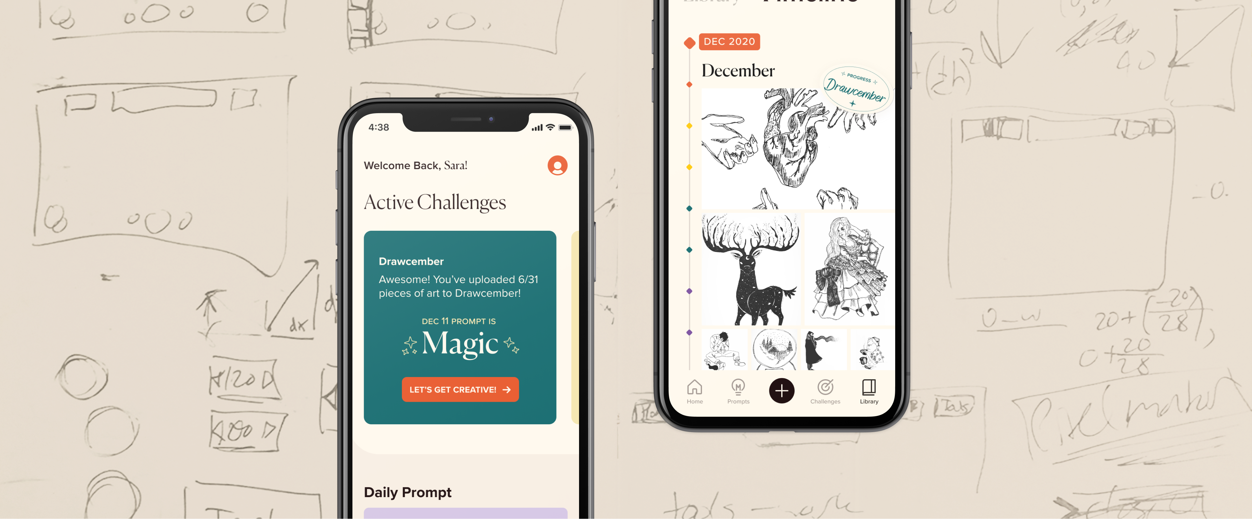
Customers discover Momentum through packaging on newly purchased Moleskine notebooks, introducing them to a personal digital space for creative growth. Stickers included with the notebook mirror those in the app, reinforcing the connection between analog and digital. Guided art challenges and prompts inspire productivity, while the private library and timeline help artists store their work and track their progress over time.
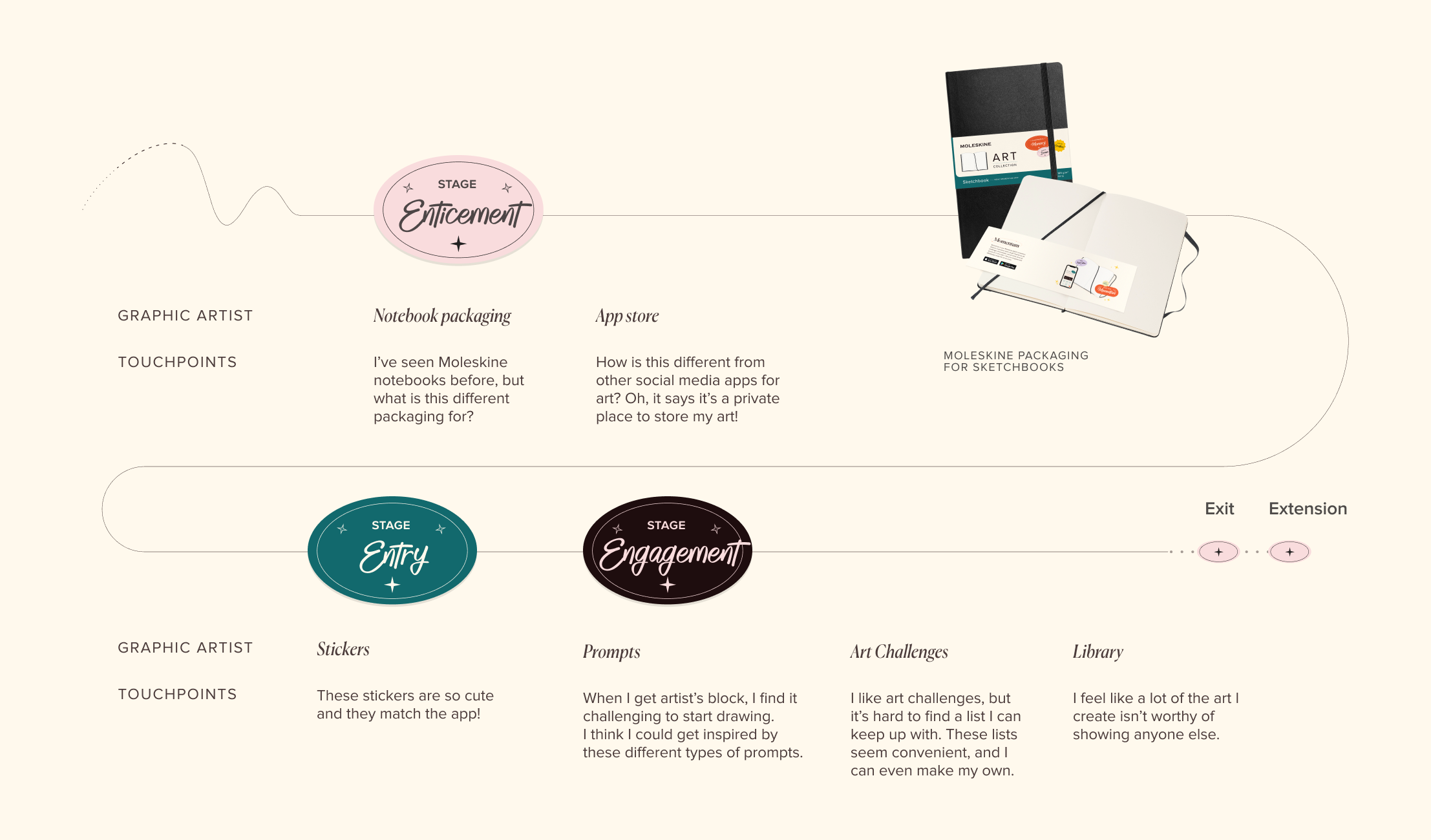
Value
By leveraging Moleskine’s existing art challenges and empowering graphic artists to create their own, Momentum increases engagement with the brand’s creative values while encouraging long-term loyalty by making creativity and Moleskine
a habit.
For Moleskine
Increases customer interaction with the business’ brand values and turns using Moleskine into a habit for long-term engagement.
For Customers
Encourages customers to create graphic art more consistently and improve their art skills.
Process
Problem Statement
Moleskine is an aspirational brand built around an iconic notebook, deeply connected to the global creative community. Through five weeks of research, we found that many customers perceive Moleskine notebooks as too valuable both in price and quality to use freely. This perception creates hesitation, particularly among graphic artists, who fear wasting pages and reserve their notebooks for “special” moments rather than everyday creative exploration.
Framing
With Moleskine’s core value of fostering creativity in mind, we framed the project around the following questions:
How might we foster creativity and productivity by leveraging Moleskine’s existing
art challenges?
How might we guide customers to use Moleskine notebooks as open platforms for
creative expression?
Primary Reseach
Over 5 weeks, we conducted 14 user interviews with people that use notebooks and affirmed that Moleskine customers often find they need a special occasion to use a Moleskine notebook. This lead us to two different kinds of customers.
The Organised Notetaker who uses notebooks to jot down notes and sketches quickly as part of her job. And the Graphic Artist that enjoys creating art in her notebook in her spare time.
Customer 1
Customer 2
Understanding the importance of Moleskine’s brand pillar to foster creativity, we chose to focus on the Graphic Artist and how their creative process could benefit from using Moleskine notebooks freely.
Primary Reseach
Over 5 weeks, we conducted 14 user interviews with people that use notebooks and affirmed that Moleskine customers often find they need a special occasion to use a Moleskine notebook. This lead us to two different kinds of customers.
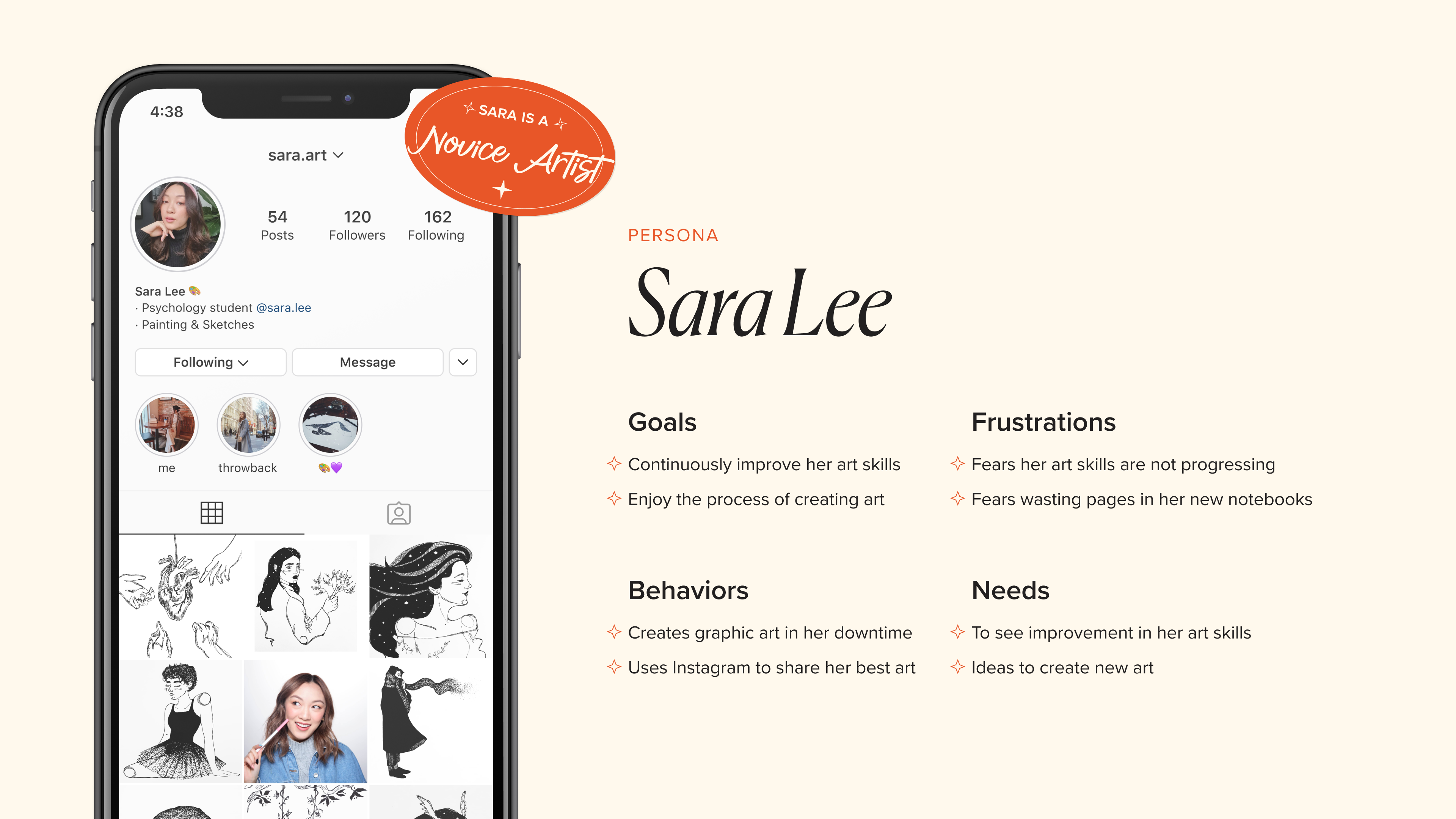
Persona
Given Moleskine’s emphasis on creativity, we chose to focus on the Graphic Artist a user whose creative process could benefit most from feeling encouraged to use their notebook freely and consistently. Our final persona, Sara, represents a novice graphic artist who creates art as a hobby. She seeks inspiration, structure, and confidence to improve her skills, and would benefit from guided prompts and challenges that reduce creative pressure and support regular artistic practice.
Prompts
Within the app, artists are provided with guided prompts to help overcome creative hesitation and begin creating. These prompts are presented on paper-inspired surfaces with rounded corners, echoing the feel of a physical notebook. A swipe interaction mimics the act of flipping pages, reinforcing the connection between the digital experience and analog creative process.
Challenges
Artists can create their own challenges to work toward personal creative goals or participate in curated Moleskine art challenges. Throughout Momentum, a mellow, warm color palette is used to create a friendly and inviting atmosphere that encourages exploration and consistent creative practice.
Challenge Complete
Throughout the creative process, the app speaks directly to artists in the second person, using “you” to create a personal, supportive tone. Playful sticker elements are used to encourage progress, and completed challenges are celebrated to reinforce confidence and creative momentum.
Library
To reinforce the brand connection, notebooks in the artist’s Library are designed to visually mirror physical Moleskine notebooks, bridging the digital experience with the tactile familiarity of the brand’s iconic products.
Timeline
The timeline brings all of an artist’s work into a single, chronological view, making progress and creative growth easy to recognize over time. At the bottom of the timeline, a personalized message highlights the date they joined Momentum, offering encouragement and reinforcing a sense of
creative continuity.
Sticker Book
A Sticker Book feature allows artists to press and drag stickers, emulating the tactile experience of peeling and placing a sticker on a physical page. This paper-inspired interaction adds a playful layer of gamification that encourages continued creation and reinforces a sense of accomplishment.
Design System
Fonts
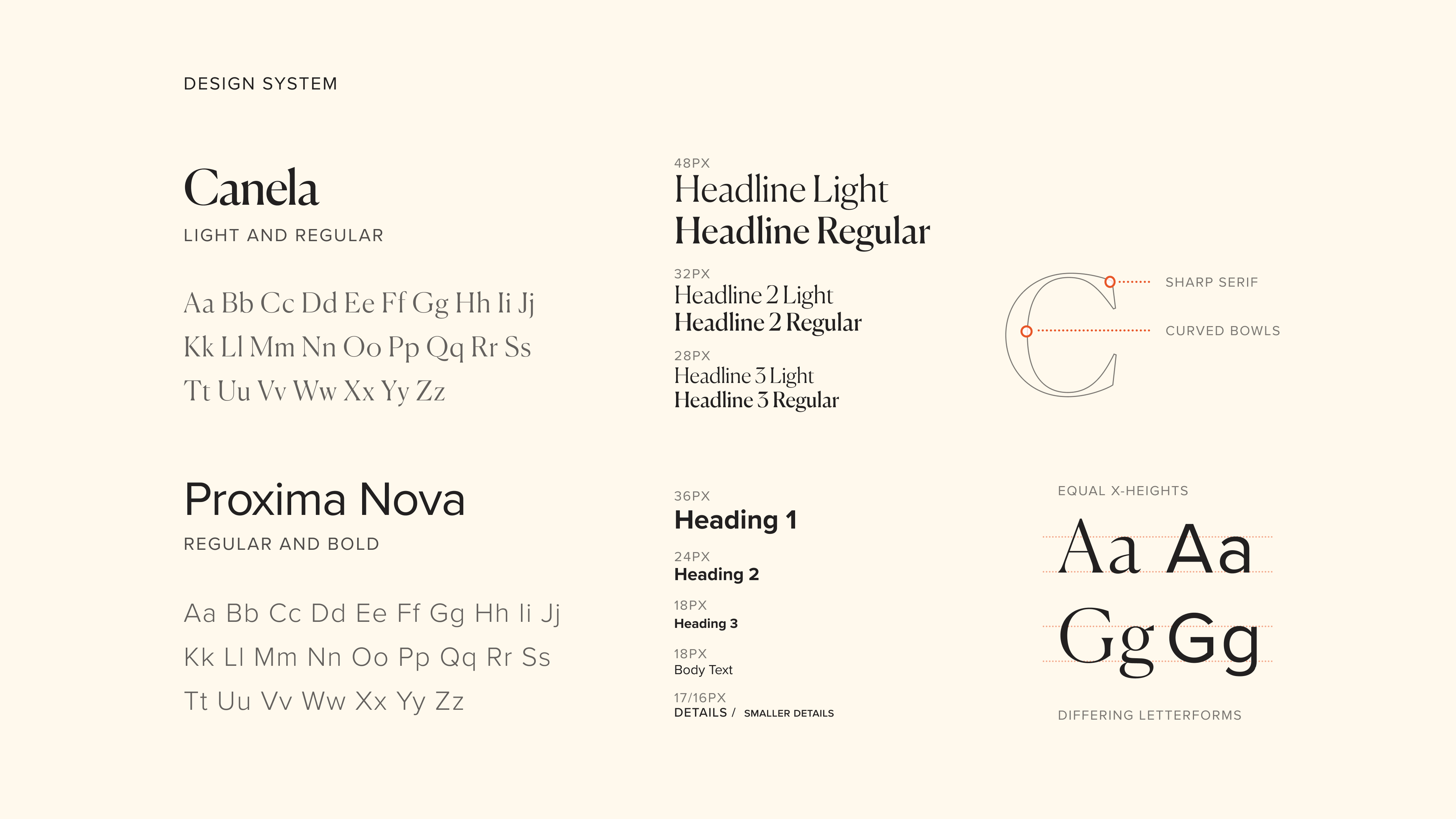
To further extend Moleskine’s identity and image of excellence, we use Canela, a font used in their annual reports. Canela is an elegant transitional serif, which is evident in its use of contrasting stroke weights, sharp serifs, and curved bowls. Proxima Nova, a mix of modern and geometric type, is mainly used for subsection headings for its uniform stroke weight and readability. This is optimally paired with Canela due to their equal x-heights to maintain cohesion and a harmonious flow from headline to the
body copy.
Color & UI Elements
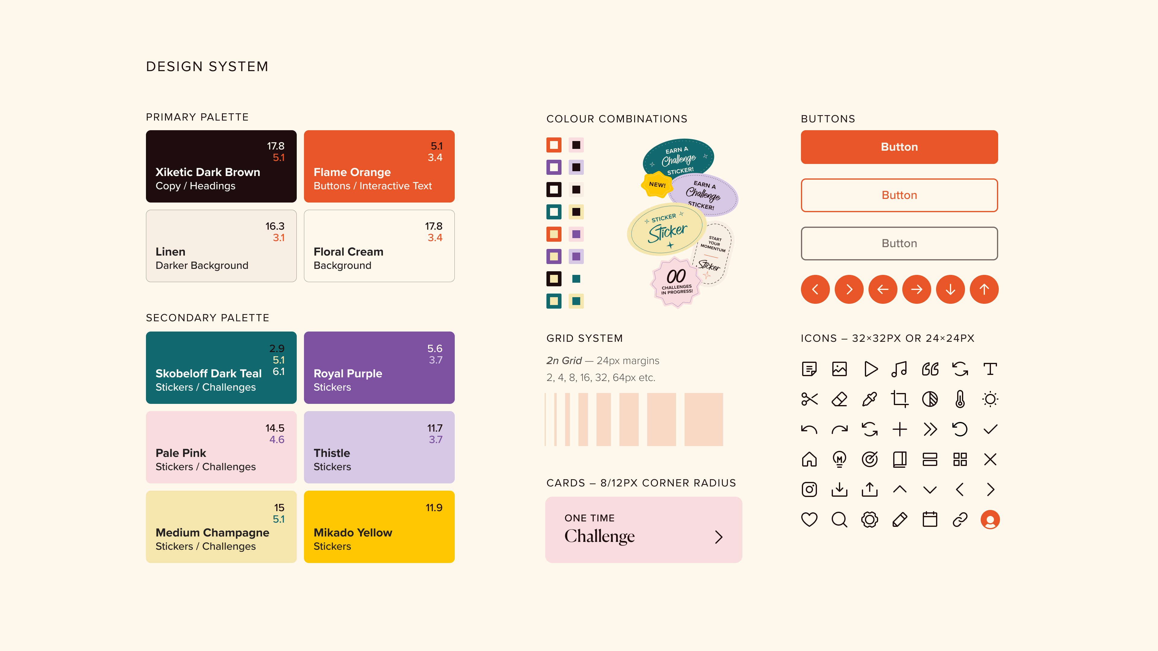
Moleskine’s bold orange is used strategically for interactive elements such as primary buttons, ensuring strong visual emphasis and clear affordance. Accessibility was considered throughout, with WCAG contrast guidelines informing color pairings to support readability across varying visual abilities. A consistent 2n spacing system establishes visual rhythm, while rounded interface cards reference the physical form of Moleskine notebooks, subtly reinforcing the brand’s
analog roots.
Art Direction
Moleskine is an aspirational brand built around an iconic notebook, deeply connected to the global creative community. Through five weeks of research, we found that many customers perceive Moleskine notebooks as too valuable both in price and quality to use freely. This perception creates hesitation, particularly among graphic artists, who fear wasting pages and reserve their notebooks for “special” moments rather than everyday creative exploration.
Design Principles
To ensure the experience feels approachable for novice graphic artists like Sara while staying true to Moleskine’s brand values, three design principles guided the
design process:
01
Be personal to build trust and provide a judgment-free space for art.
02
Be encouraging to motivate and support graphic artists on their art journey.
03
Be lively to engage artists with friendly and creative energy.
Momentum
Experience Design Short Film
Momentum is a UX-driven digital concept that helps emerging graphic artists stay creatively engaged through guided art challenges, prompts, and private artwork storage. I led the art direction and video-based prototype, crafting motion and sound-led experiences using found footage with Adobe Premiere Pro, Figma, and Adobe Photoshop, while also contributing to ideation, visual design, and the design system. Built on Moleskine’s existing art challenges, Momentum explores how digital products can deepen brand connection and encourage long-term engagement — you can view the prototype here
Contributions
I led the video presentation and storytelling of the prototype, using found footage to communicate the concept, user journey, and value of the product. I also led the visual design of the homepage, ensuring the experience felt engaging and aligned with the overall narrative. In addition, I contributed heavily to research, ideation, and the design system, supporting the project’s UX foundation while helping translate strategy into a clear, compelling visual story.


Tina Alidaei | 2026
Takeaway
This project reinforced how much can be accomplished in a short timeframe through strong time management, attention to detail, and rapid iteration. Over the five-week sprint, our team initially struggled to land on a focused, innovative concept, testing and discarding ideas weekly before narrowing the target audience and project scope in the final weeks. This shift allowed us to move forward with clarity and build a cohesive solution without starting from scratch.
Working closely on the UI and art direction, I gained valuable experience defining design principles that aligned with Moleskine’s identity while creating a welcoming, approachable experience for users. The fast-paced nature of the project strengthened my ability to make confident design decisions, think strategically under pressure, and translate abstract ideas into a clear visual and narrative direction.
Business Value & Customer Journey
Journey Map
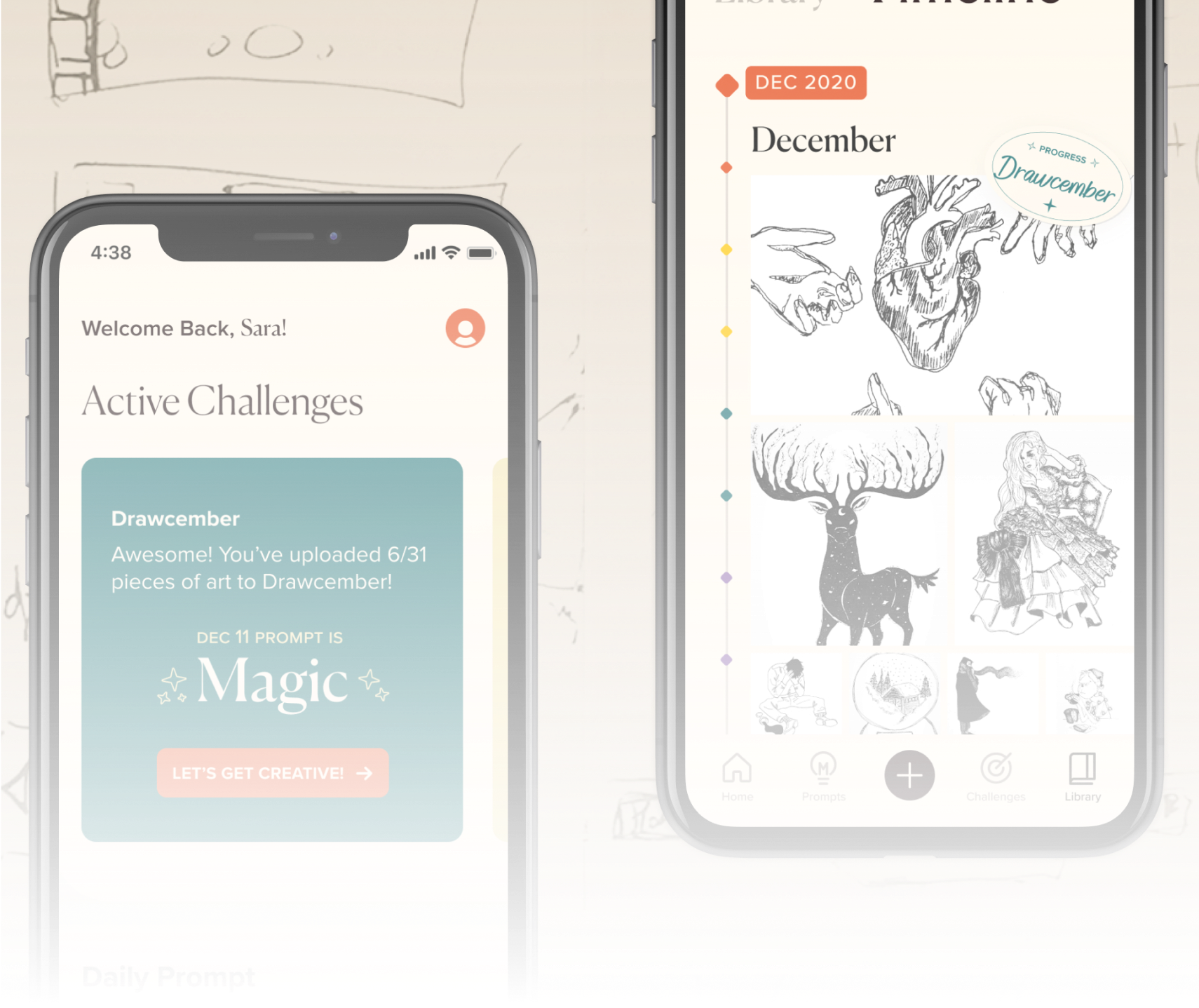
Customers discover Momentum through packaging on newly purchased Moleskine notebooks, introducing them to a personal digital space for creative growth. Stickers included with the notebook mirror those in the app, reinforcing the connection between analog and digital. Guided art challenges and prompts inspire productivity, while the private library and timeline help artists store their work and track their progress over time.
Value
By leveraging Moleskine’s existing art challenges and empowering graphic artists to create their own, Momentum increases engagement with the brand’s creative values while encouraging long-term loyalty by making creativity and Moleskine a habit.
For Moleskine
Increases customer interaction with the business’ brand values and turns using Moleskine into a habit for long-term engagement.
For Customers
Encourages customers to create graphic art more consistently and improve their art skills.
Prompts
Within the app, artists are provided with guided prompts to help overcome creative hesitation and begin creating. These prompts are presented on paper-inspired surfaces with rounded corners, echoing the feel of a physical notebook. A swipe interaction mimics the act of flipping pages, reinforcing the connection between the digital experience and analog creative process.
Challenges
Artists can create their own challenges to work toward personal creative goals or participate in curated Moleskine art challenges. Throughout Momentum, a mellow, warm color palette is used to create a friendly and inviting atmosphere that encourages exploration and consistent creative practice.
Challenge Complete
Throughout the creative process, the app speaks directly to artists in the second person, using “you” to create a personal, supportive tone. Playful sticker elements are used to encourage progress, and completed challenges are celebrated to reinforce confidence and creative momentum.
Library
To reinforce the brand connection, notebooks in the artist’s Library are designed to visually mirror physical Moleskine notebooks, bridging the digital experience with the tactile familiarity of the brand’s iconic products.
Timeline
The timeline brings all of an artist’s work into a single, chronological view, making progress and creative growth easy to recognize over time. At the bottom of the timeline, a personalized message highlights the date they joined Momentum, offering encouragement and reinforcing a sense of
creative continuity.
Sticker Book
A Sticker Book feature allows artists to press and drag stickers, emulating the tactile experience of peeling and placing a sticker on a physical page. This paper-inspired interaction adds a playful layer of gamification that encourages continued creation and reinforces a sense of accomplishment.
Design Principles
To ensure the experience feels approachable for novice graphic artists like Sara while staying true to Moleskine’s brand values, three design principles guided the
design process:
01
Be personal to build trust and provide a judgment-free space for art.
02
Be encouraging to motivate and support graphic artists on their art journey.
03
Be lively to engage artists with friendly and creative energy.
Design System
Fonts
To further extend Moleskine’s identity and image of excellence, we use Canela, a font used in their annual reports. Canela is an elegant transitional serif, which is evident in its use of contrasting stroke weights, sharp serifs, and curved bowls. Proxima Nova, a mix of modern and geometric type, is mainly used for subsection headings for its uniform stroke weight and readability. This is optimally paired with Canela due to their equal x-heights to maintain cohesion and a harmonious flow from headline to the body copy.
Color & UI Elements
Moleskine’s bold orange is used strategically for interactive elements such as primary buttons, ensuring strong visual emphasis and clear affordance. Accessibility was considered throughout, with WCAG contrast guidelines informing color pairings to support readability across varying visual abilities. A consistent 2n spacing system establishes visual rhythm, while rounded interface cards reference the physical form of Moleskine notebooks, subtly reinforcing the brand’s
analog roots.
Art Direction
Moleskine is an aspirational brand built around an iconic notebook, deeply connected to the global creative community. Through five weeks of research, we found that many customers perceive Moleskine notebooks as too valuable both in price and quality to use freely. This perception creates hesitation, particularly among graphic artists, who fear wasting pages and reserve their notebooks for “special” moments rather than everyday creative exploration.
Framing
With Moleskine’s core value of fostering creativity in mind, we framed the project around the following questions:
How might we foster creativity and productivity by leveraging Moleskine’s existing
art challenges?
How might we guide customers to use Moleskine notebooks as open platforms for
creative expression?
Primary Reseach
Primary Reseach
Over 5 weeks, we conducted 14 user interviews with people that use notebooks and affirmed that Moleskine customers often find they need a special occasion to use a Moleskine notebook. This lead us to two different kinds of customers.
Over 5 weeks, we conducted 14 user interviews with people that use notebooks and affirmed that Moleskine customers often find they need a special occasion to use a Moleskine notebook. This lead us to two different kinds of customers.
The Organised Notetaker who uses notebooks to jot down notes and sketches quickly as part of her job. And the Graphic Artist that enjoys creating art in her notebook in her spare time.
Customer 1
Customer 2
Understanding the importance of Moleskine’s brand pillar to foster creativity, we chose to focus on the Graphic Artist and how their creative process could benefit from using Moleskine notebooks freely.
Persona
Given Moleskine’s emphasis on creativity, we chose to focus on the Graphic Artist a user whose creative process could benefit most from feeling encouraged to use their notebook freely and consistently. Our final persona, Sara, represents a novice graphic artist who creates art as a hobby. She seeks inspiration, structure, and confidence to improve her skills, and would benefit from guided prompts and challenges that reduce creative pressure and support regular artistic practice.
Process
Problem Statement
Moleskine is an aspirational brand built around an iconic notebook, deeply connected to the global creative community. Through five weeks of research, we found that many customers perceive Moleskine notebooks as too valuable both in price and quality to use freely. This perception creates hesitation, particularly among graphic artists, who fear wasting pages and reserve their notebooks for “special” moments rather than everyday creative exploration.
Momentum
Experience Design
Momentum is a UX-driven digital concept that supports emerging graphic artists through guided art challenges, creative prompts, and private artwork storage. Built on Moleskine’s existing art challenges, the project explores how digital experiences can deepen brand engagement. I contributed across ideation, research, and UX/UI design, while leading the art direction, content design, and visual presentation of the prototype.
You can view the prototype here.
Contributions
I led the video presentation and storytelling of the prototype, using found footage to communicate the concept, user journey, and value of the product. I also led the visual design of the homepage, ensuring the experience felt engaging and aligned with the overall narrative. In addition, I contributed heavily to research, ideation, and the design system, supporting the project’s UX foundation while helping translate strategy into a clear, compelling visual story.

Tina Alidaei | 2026


Takeaway
This project reinforced how much can be accomplished in a short timeframe through strong time management, attention to detail, and rapid iteration. Over the five-week sprint, our team initially struggled to land on a focused, innovative concept, testing and discarding ideas weekly before narrowing the target audience and project scope in the final weeks. This shift allowed us to move forward with clarity and build a cohesive solution without starting from scratch.
Working closely on the UI and art direction, I gained valuable experience defining design principles that aligned with Moleskine’s identity while creating a welcoming, approachable experience for users. The fast-paced nature of the project strengthened my ability to make confident design decisions, think strategically under pressure, and translate abstract ideas into a clear visual and narrative direction.
Business Value & Customer Journey
Journey Map
Customers discover Momentum through packaging on newly purchased Moleskine notebooks, introducing them to a personal digital space for creative growth. Stickers included with the notebook mirror those in the app, reinforcing the connection between analog and digital. Guided art challenges and prompts inspire productivity, while the private library and timeline help artists store their work and track their progress over time.
Prompts
Within the app, artists are provided with guided prompts to help overcome creative hesitation and begin creating. These prompts are presented on paper-inspired surfaces with rounded corners, echoing the feel of a physical notebook. A swipe interaction mimics the act of flipping pages, reinforcing the connection between the digital experience and analog creative process.
Challenges
Artists can create their own challenges to work toward personal creative goals or participate in curated Moleskine art challenges. Throughout Momentum, a mellow, warm color palette is used to create a friendly and inviting atmosphere that encourages exploration and consistent creative practice.
Challenge Complete
Throughout the creative process, the app speaks directly to artists in the second person, using “you” to create a personal, supportive tone. Playful sticker elements are used to encourage progress, and completed challenges are celebrated to reinforce confidence and creative momentum.
Library
To reinforce the brand connection, notebooks in the artist’s Library are designed to visually mirror physical Moleskine notebooks, bridging the digital experience with the tactile familiarity of the brand’s iconic products.
Timeline
The timeline brings all of an artist’s work into a single, chronological view, making progress and creative growth easy to recognize over time. At the bottom of the timeline, a personalized message highlights the date they joined Momentum, offering encouragement and reinforcing a sense of
creative continuity.
Sticker Book
A Sticker Book feature allows artists to press and drag stickers, emulating the tactile experience of peeling and placing a sticker on a physical page. This paper-inspired interaction adds a playful layer of gamification that encourages continued creation and reinforces a sense of accomplishment.
Design Principles
To ensure the experience feels approachable for novice graphic artists like Sara while staying true to Moleskine’s brand values, three design principles guided the
design process:
01
Be personal to build trust and provide a judgment-free space for art.
02
Be encouraging to motivate and support graphic artists on their art journey.
03
Be lively to engage artists with friendly and creative energy.
Design System
Fonts
To further extend Moleskine’s identity and image of excellence, we use Canela, a font used in their annual reports. Canela is an elegant transitional serif, which is evident in its use of contrasting stroke weights, sharp serifs, and curved bowls. Proxima Nova, a mix of modern and geometric type, is mainly used for subsection headings for its uniform stroke weight and readability. This is optimally paired with Canela due to their equal x-heights to maintain cohesion and a harmonious flow from headline to the body copy.
Color & UI Elements
Moleskine’s bold orange is used strategically for interactive elements such as primary buttons, ensuring strong visual emphasis and clear affordance. Accessibility was considered throughout, with WCAG contrast guidelines informing color pairings to support readability across varying visual abilities. A consistent 2n spacing system establishes visual rhythm, while rounded interface cards reference the physical form of Moleskine notebooks, subtly reinforcing the brand’s analog roots.
Art Direction
Moleskine is an aspirational brand built around an iconic notebook, deeply connected to the global creative community. Through five weeks of research, we found that many customers perceive Moleskine notebooks as too valuable both in price and quality to use freely. This perception creates hesitation, particularly among graphic artists, who fear wasting pages and reserve their notebooks for “special” moments rather than everyday creative exploration.
Framing
With Moleskine’s core value of fostering creativity in mind, we framed the project around the following questions:
How might we foster creativity and productivity by leveraging Moleskine’s existing
art challenges?
How might we guide customers to use Moleskine notebooks as open platforms for
creative expression?
Primary Reseach
Over 5 weeks, we conducted 14 user interviews with people that use notebooks and affirmed that Moleskine customers often find they need a special occasion to use a Moleskine notebook. This lead us to two different kinds of customers.
The Organised Notetaker who uses notebooks to jot down notes and sketches quickly as part of her job. And the Graphic Artist that enjoys creating art in her notebook in her spare time.
Customer 1
Customer 2
Understanding the importance of Moleskine’s brand pillar to foster creativity, we chose to focus on the Graphic Artist and how their creative process could benefit from using Moleskine notebooks freely.
Persona
Given Moleskine’s emphasis on creativity, we chose to focus on the Graphic Artist—a user whose creative process could benefit most from feeling encouraged to use their notebook freely and consistently. Our final persona, Sara, represents a novice graphic artist who creates art as a hobby. She seeks inspiration, structure, and confidence to improve her skills, and would benefit from guided prompts and challenges that reduce creative pressure and support regular artistic practice.
Process
Problem Statement
Moleskine is an aspirational brand built around an iconic notebook, deeply connected to the global creative community. Through five weeks of research, we found that many customers perceive Moleskine notebooks as too valuable both in price and quality to use freely. This perception creates hesitation, particularly among graphic artists, who fear wasting pages and reserve their notebooks for “special” moments rather than everyday creative exploration.
Momentum
Experience Design
Momentum is a UX-driven digital concept that supports emerging graphic artists through guided art challenges, creative prompts, and private artwork storage. Built on Moleskine’s existing art challenges, the project explores how digital experiences can deepen brand engagement. I contributed across ideation, research, and UX/UI design, while leading the art direction, content design, and visual presentation of the prototype.
You can view the prototype here.
Contributions
I led the video presentation and storytelling of the prototype, using found footage to communicate the concept, user journey, and value of the product. I also led the visual design of the homepage, ensuring the experience felt engaging and aligned with the overall narrative. In addition, I contributed heavily to research, ideation, and the design system, supporting the project’s UX foundation while helping translate strategy into a clear, compelling visual story.
