Tina Alidaei | 2026


Takeaway
Through this project, I learned how to come up with an idea and communicate that via visual design through converging and diverging as well as a grouping. I have worked to create mood boards in the past but through this project, I learned how to create a feeling and sense to communicate the idea through the grouping of images. The project improved my art direction and visual design skills while using a mood board to keep everything on track and cohesive.
Typography
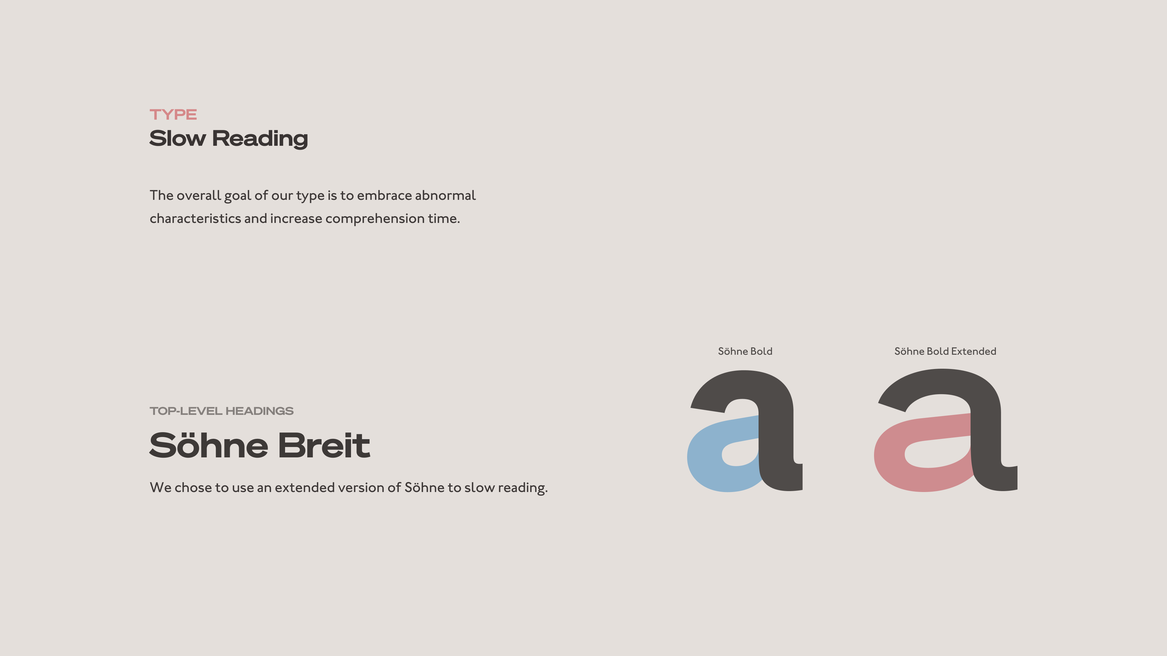
The overall goal of our type is to embrace abnormal characteristics and increase comprehension time.
Söhne Breit
We chose to use an extended version of Söhne to slow reading. The goal of our type is to embrace abnormal characteristics Sohne Breit was chosen because its extended version slows reading. We were inspired by how brody used negative space to showcase the letters, and you can see this in interaction one. The final iteration does not use negative space, but rather the letters are morphed together and reflect the shape of the blobs.
Johnstone ITC
Johnstone ITC medium is used as our body text. The overall goal of our type is to embrace abnormal characteristics and increase comprehension time. We chose Johnston ITC because its uniform stroke weight makes it readable and the diamond-shaped dot found on the i and j allows viewers to encounter an uncommon trait.
Color Palette
The pale colors dull uncomfortable visuals to prevent horror and allow art enthusiasts to appreciate unusual artwork.
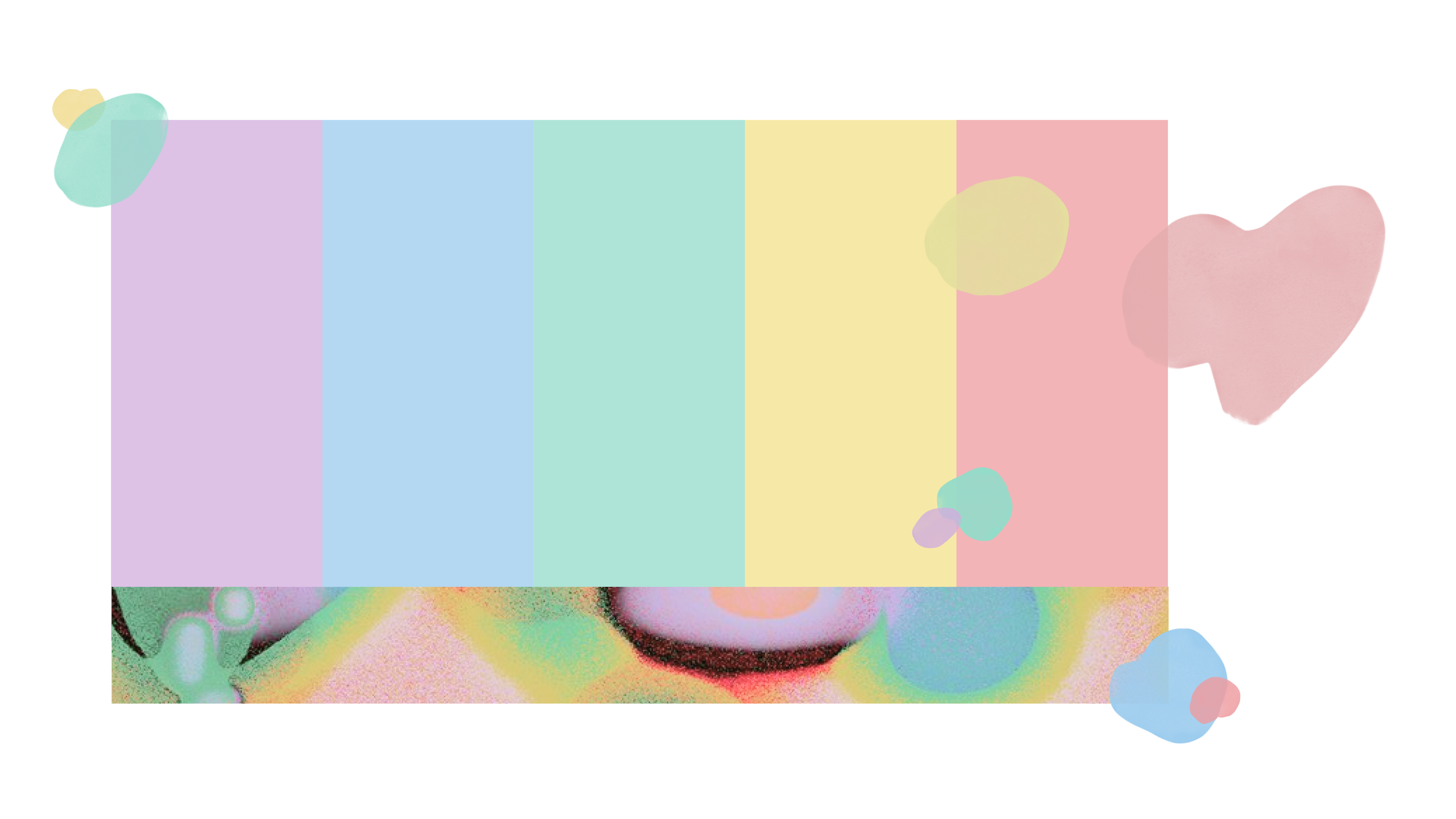
Image Treatment
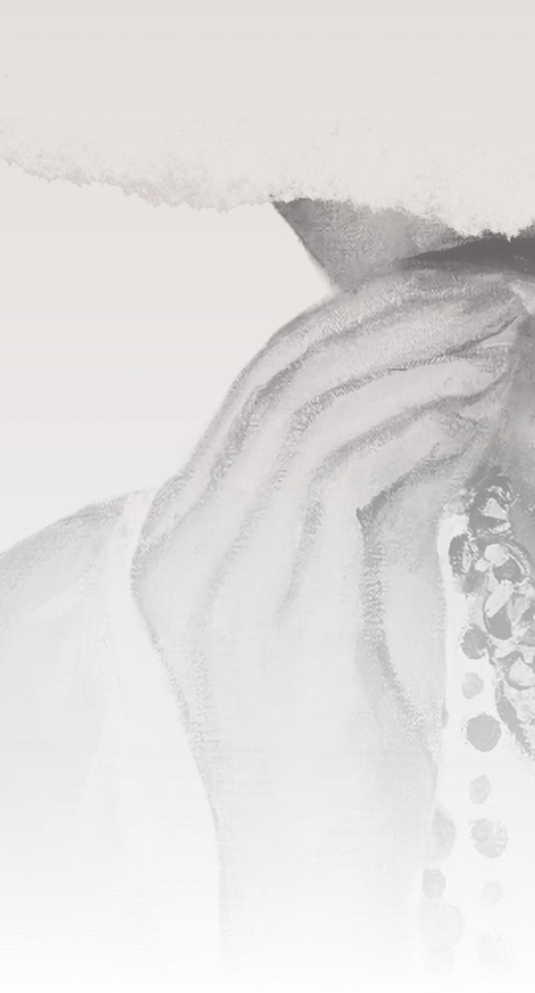
The images are desaturated and warmed to appear aged. The lack of true blacks softens the unnatural visuals in order to avoid repulsion to pique viewers’ interest in abnormal artwork. This also helps maintain consistent branding for artworks that come in many different colors.
Digital Assets
Website
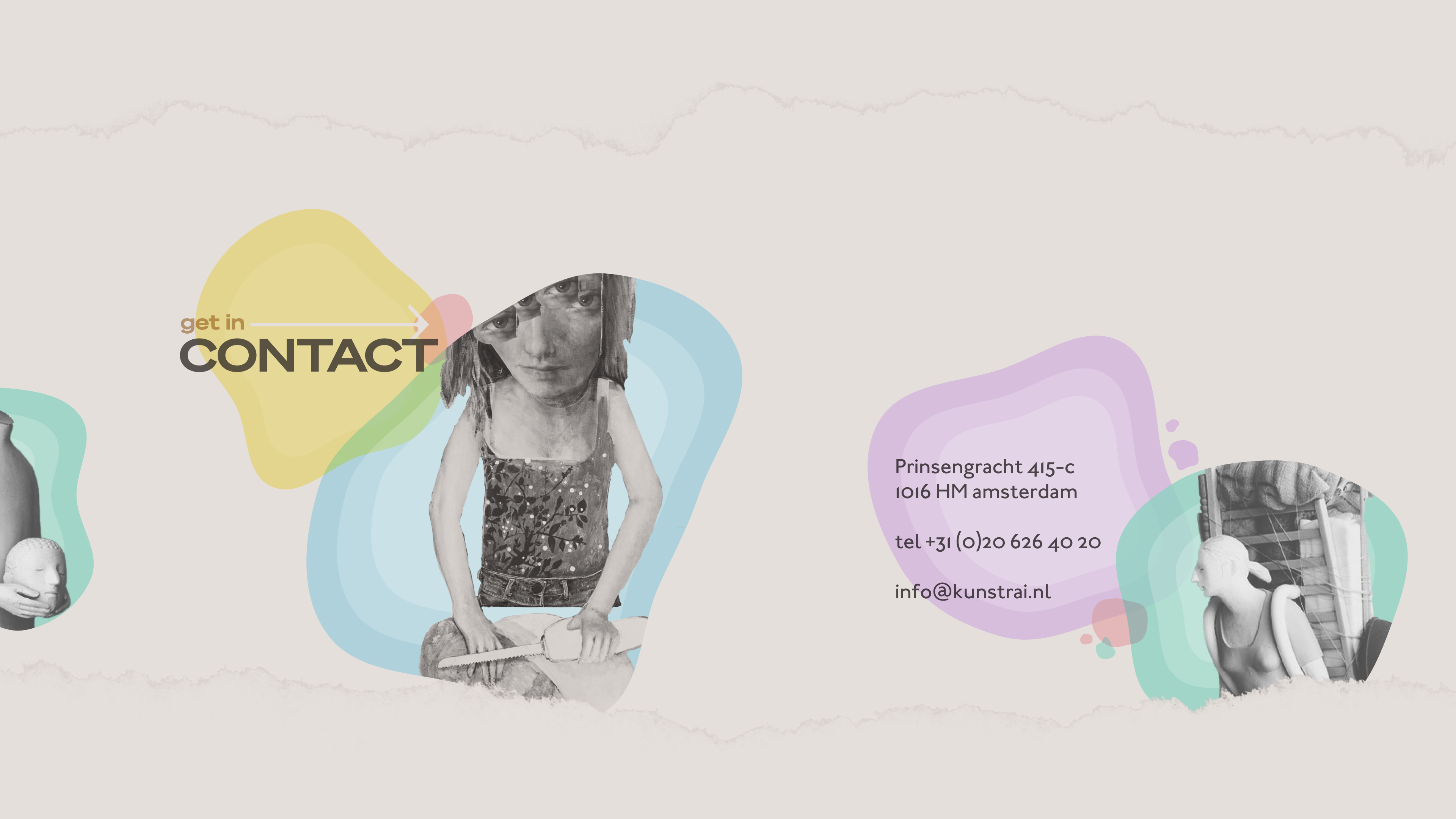
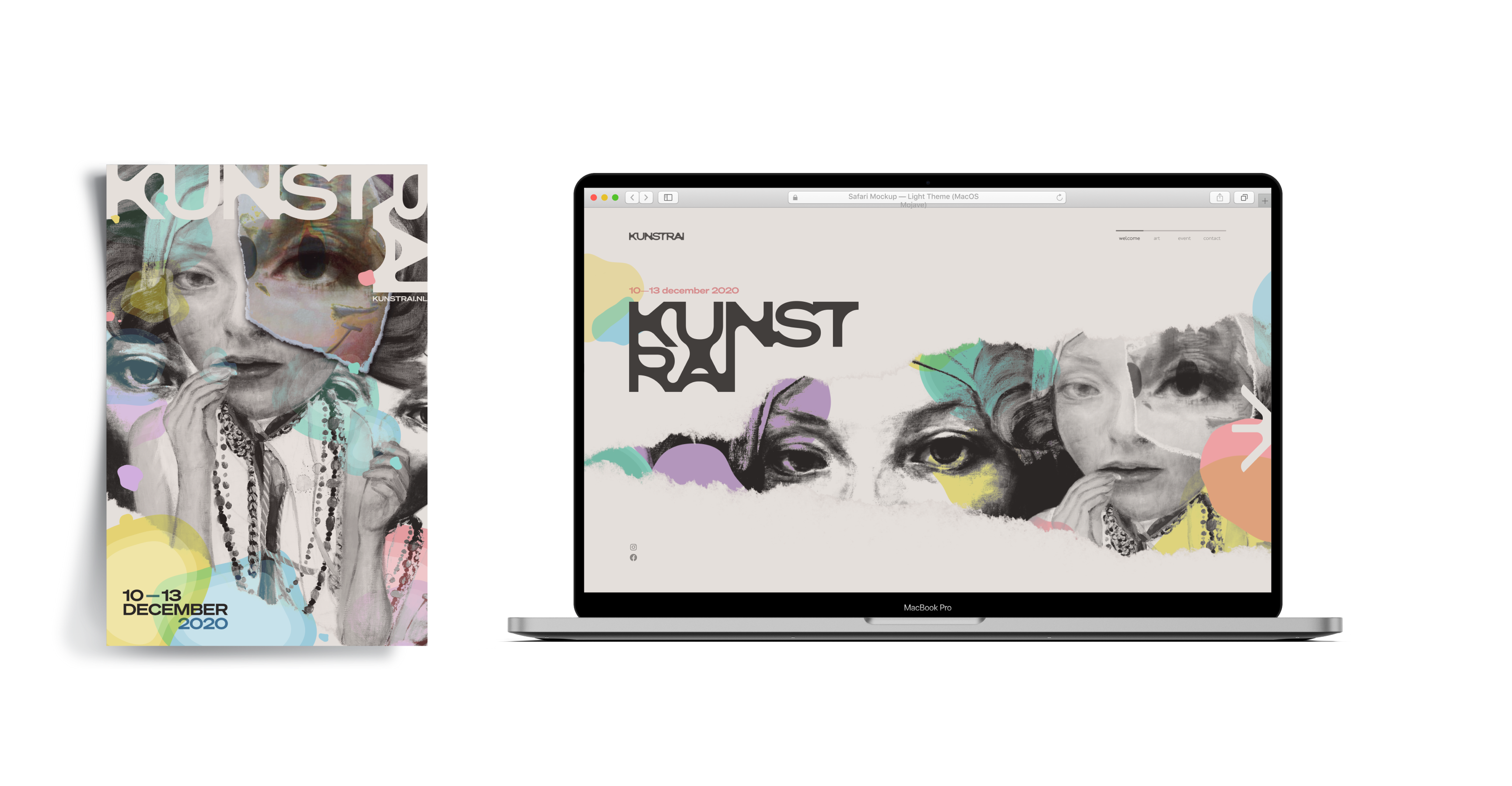
Our first digital asset for KunstRai art event is a website. On the website transparent blobs can be seen where they set in a rhythmic manner, starting from the KunstRAI logo and revealing itself through tears in the page.
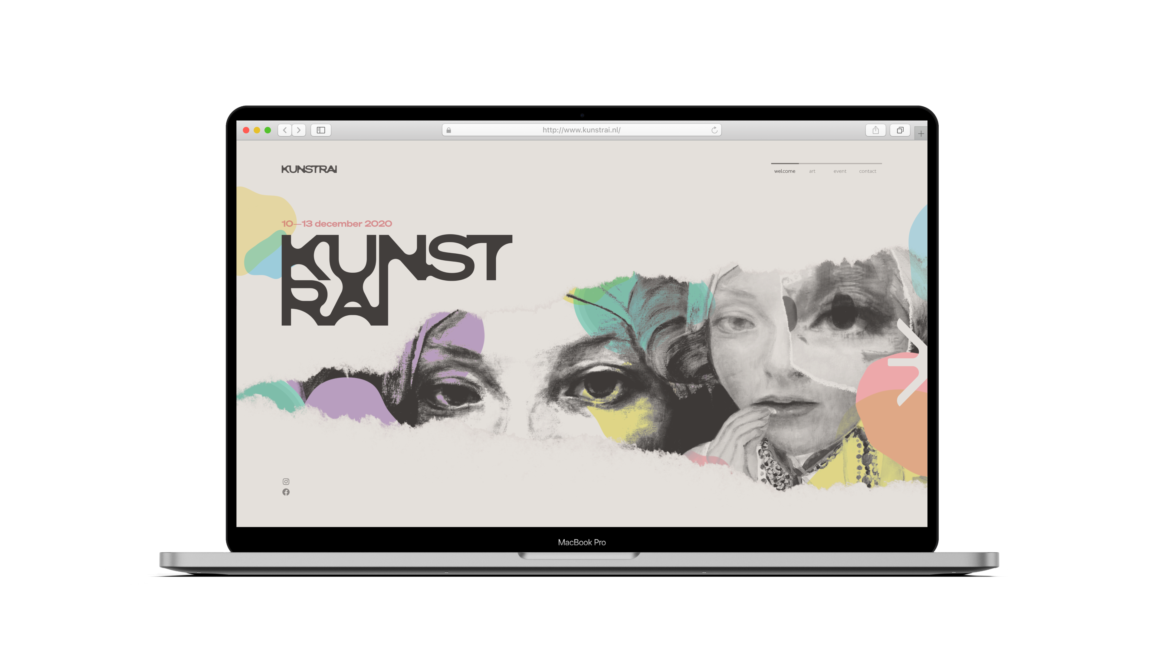
This partially-concealed element of the landing page invites the viewer to continue scrolling to reveal more. These wandering eyes may elicit an uncomfortable, but a mesmerizing feeling. eyes dart sideways and draw focus to the arrow on the right.
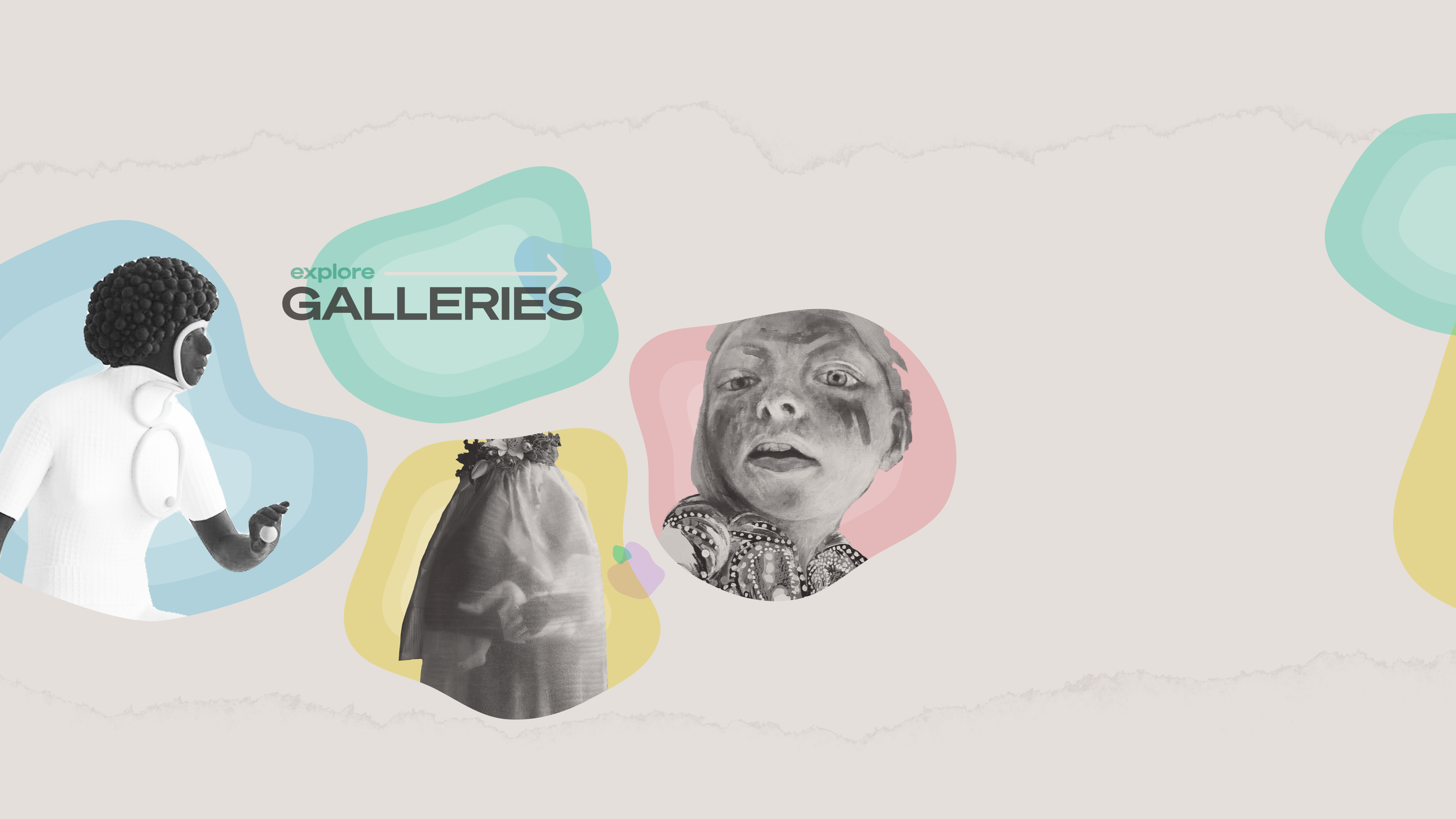
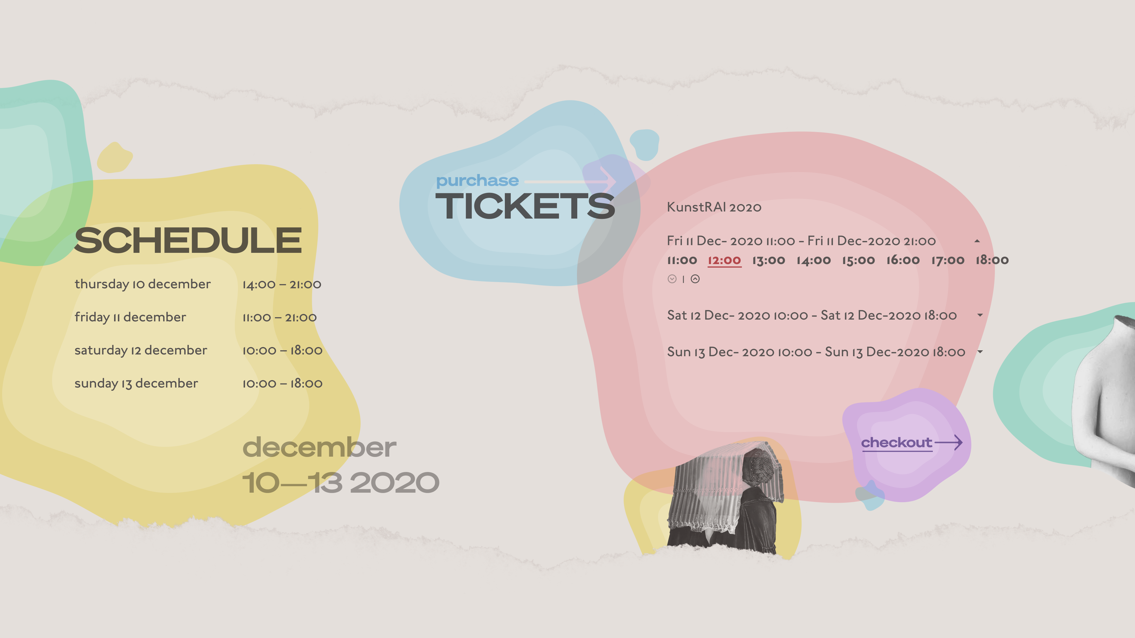
This horizontal scroll feature creates a continuous narrative across all pages, where blobs are laid out to push attention towards the right. In the end, visitors can be prompted to purchase tickets and see specific timeslots for entry.
Please scroll horizontally
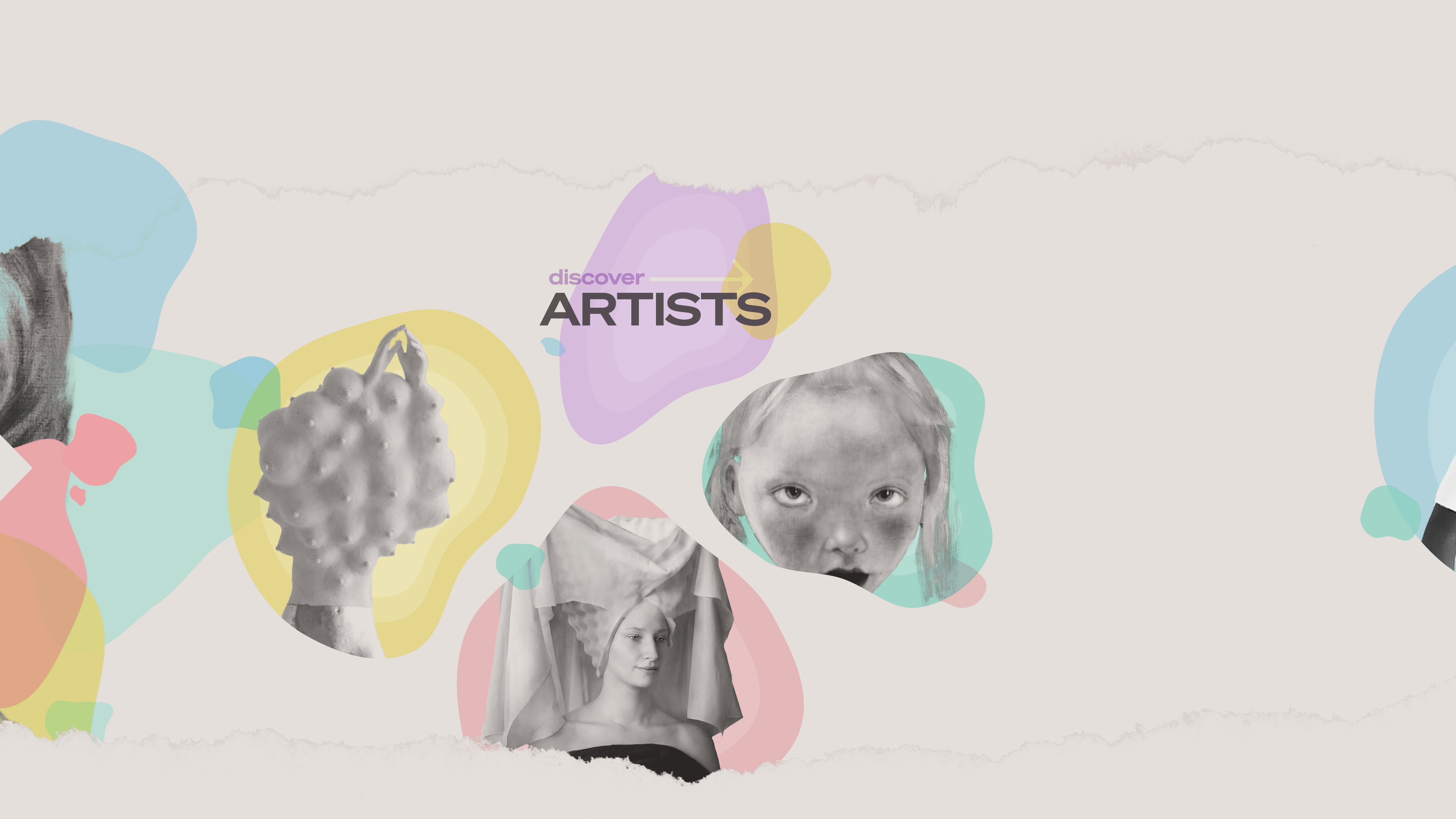
Though mainly drawing visual attention, these artist blobs serve as an entry point to discover each individual featured artist. Ideally, these hovers would lead to a clickthrough where visitors can learn more about each artist.
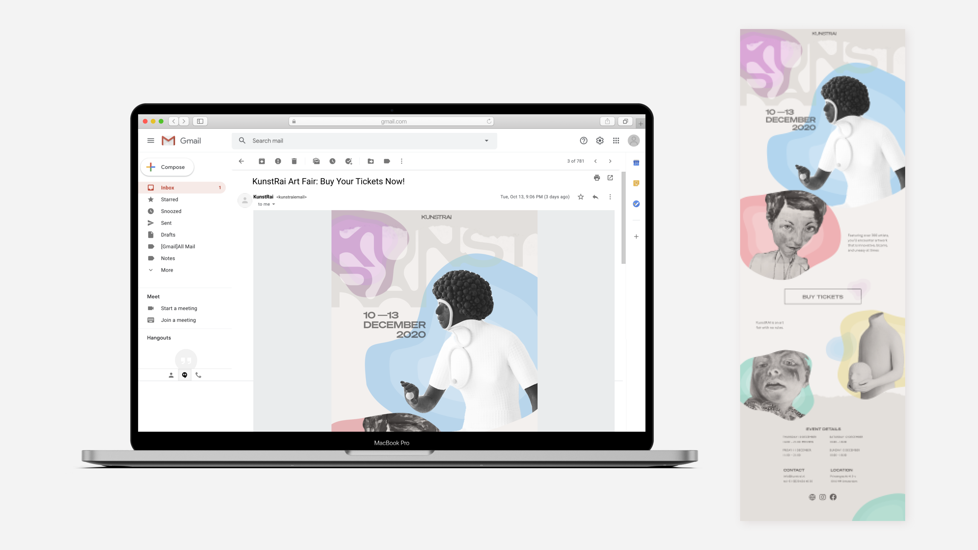
Another asset is the email newsletter which provides ticket information. The email is led by intriguing pieces of art. The bottom of the email provides a prompt to purchase tickets, information about the event, scheduling, as well as social media accounts.
It mimics the identity of the website using the blobby text at the top, the grotesque artwork and transparent blobs that guide you through the email. Using the blobs there is a sense of continuity that leads you downwards in the email.
Instagram Stories
Instagram stories access a wider audience and they act as advertisements. It has a similar identity to the website's landing page and it's an animation that taps through from the first subject to the second wandering eyes.
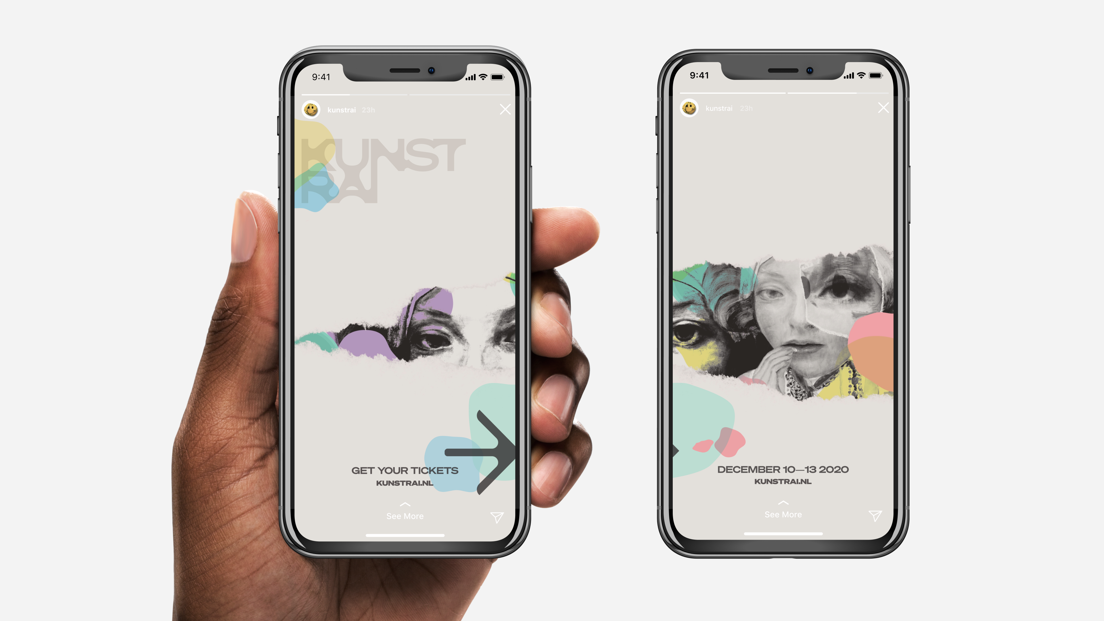
Using concealing elements gives a sense of curiosity and the leading arrow invites the viewer to go to the next one. The stories invite you to access the website and buy tickets to the events.
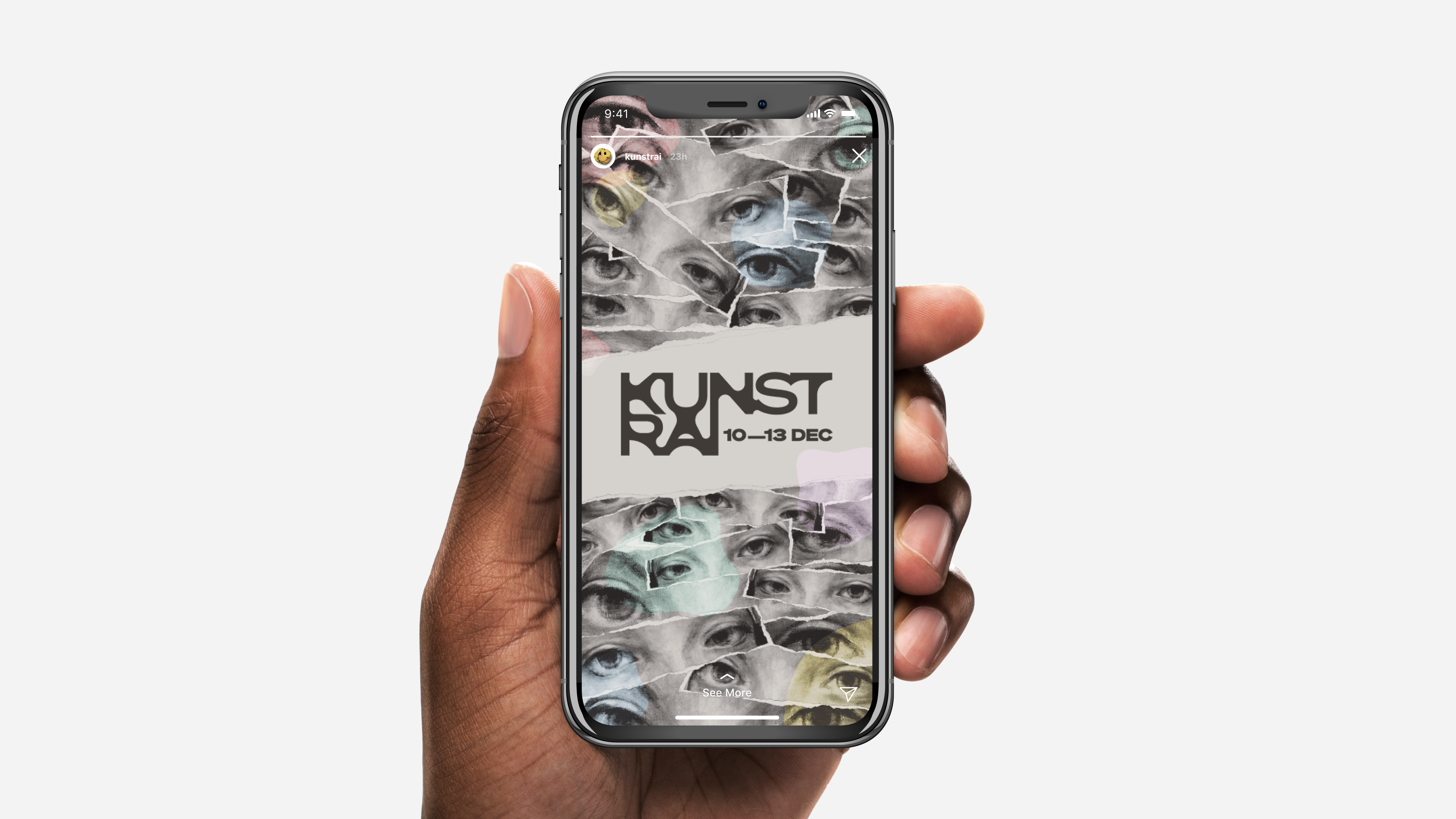
We created a second story as well which uses similar elements. The advertisements in motion here. We specifically choose the eyes from the painting to give a sense of discomfort. Using piles of paper eye cutouts to draw a feeling of someone watching you. Just a reiteration/alternative to the usual motion graphic. Having less information on the stories, makes them become more mysterious.
Graphic Assets
Poster and Wristband
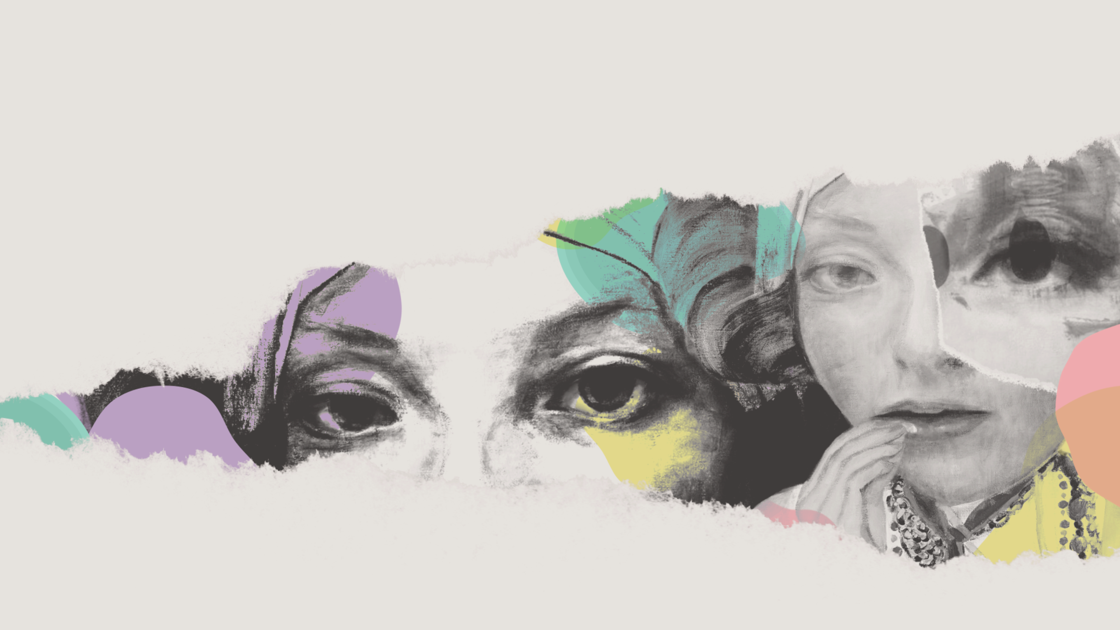
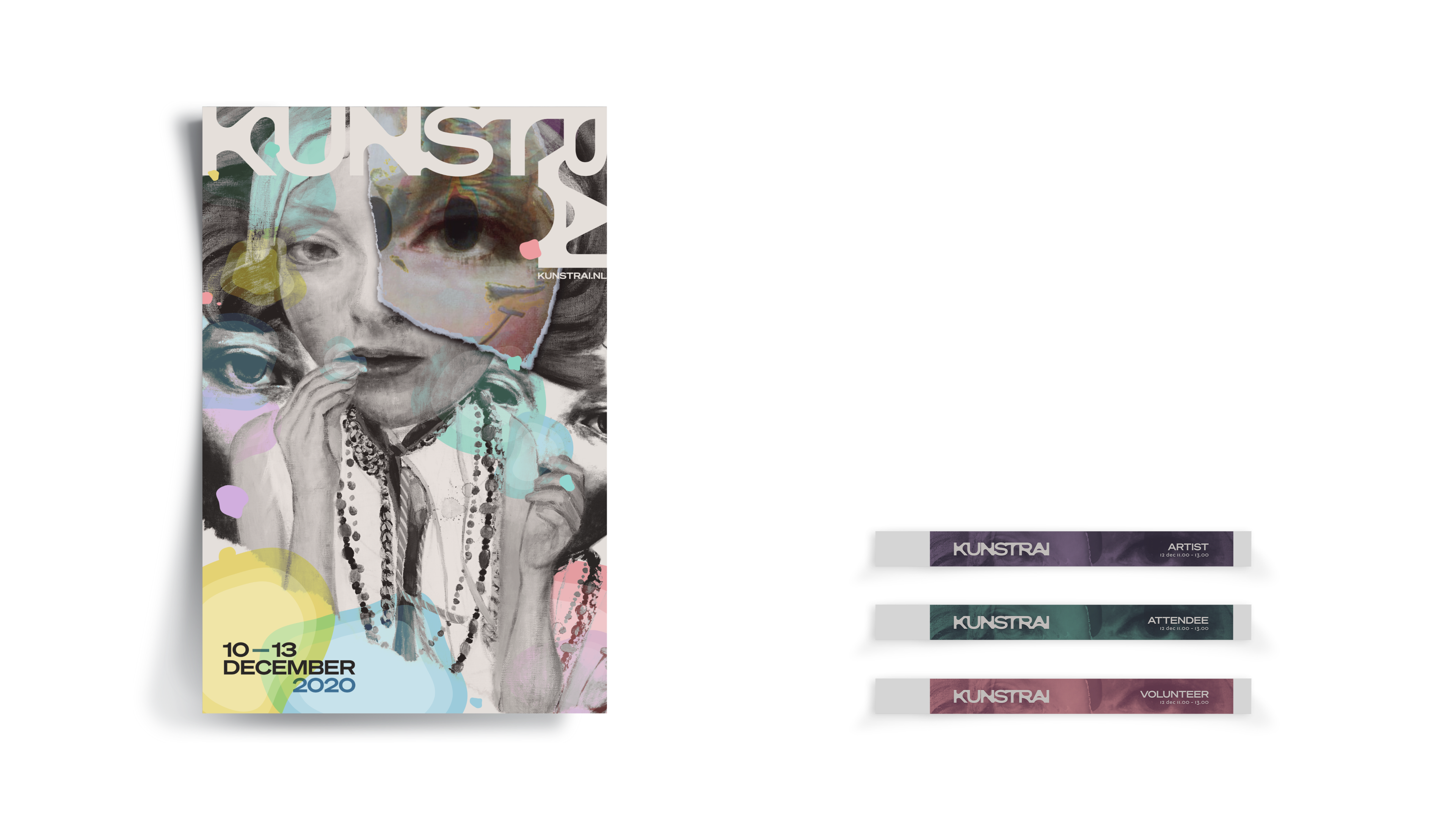
From here we created three graphics and three digital assets. Our first graphic asset is a poster. For the title, we took inspiration from Brody. Brody manipulated type and used negative space for the title. The title mimics this method and takes a moment to read which makes the viewer engage with the poster longer. The transparent blobs used on the poster, balance the focus from image to written information. The pastel colors give some life to otherwise creepy, duller images
Our second supporting assets are wristbands, which shift to the functional purpose. Their design hint the viewer at what the image is, but doesn’t show itself fully in order to pique some curiosity of what the art event will be about. The eye is in focus near the title, to maintain an uncomfortable feeling. These bands are color-coded to each visitor, timeslots for COVID-19 purposes
Program
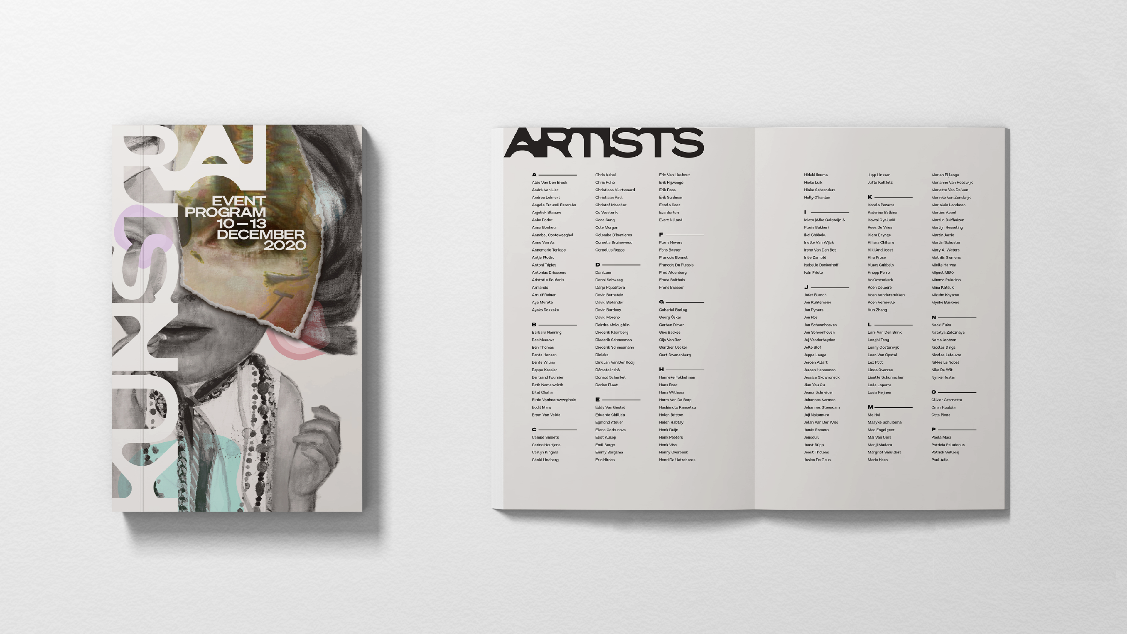
Our third graphic asset is a program. The art event comes with a program that provides information on the artworks as well as the artists. The cover of the program cover is expressive, and blobs act as guiding visual elements, the color draws attention to information. Inside the program is more functional. This ‘fused’ type is seen for some headings throughout the identity, where letters are morphed together to create fresh, curvy ligatures, similar to the blob elements.
Mood board
Once our question was finalized, we gathered and grouped images to explore our ideas and insights and help expand our thinking, to further investigate our question
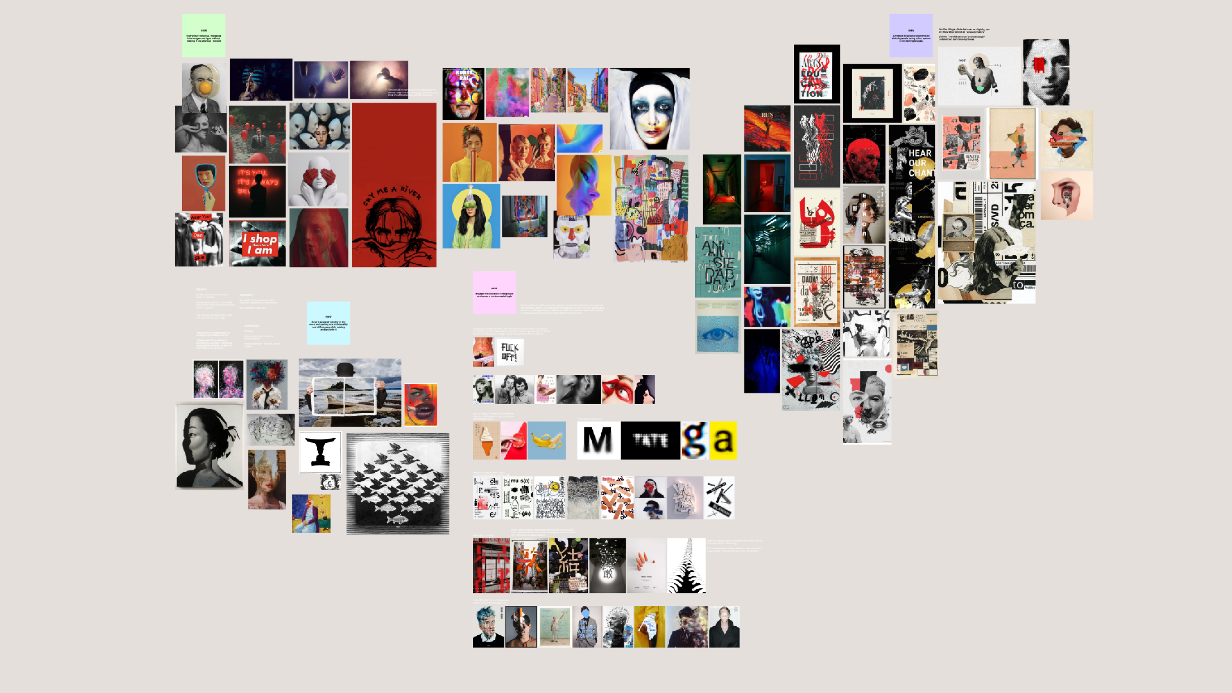
Following several iterations of grouping images, we described each group of images, highlighted words related to our insights, and narrowed it down into one final mood board and copy. (See image and content below)
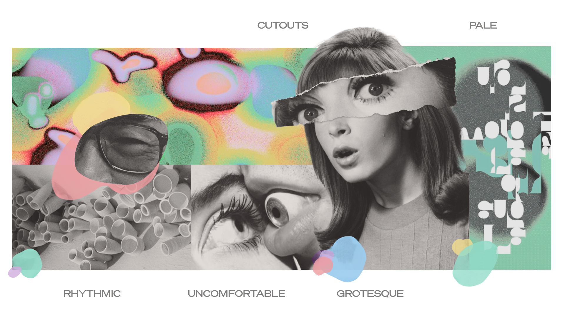
For art enthusiasts that investigate bizarre art, this approach adopts uncommon preferences as it wavers between disgust and delight. The layered cutouts enhance grotesque visuals that evoke discomfort. Odd shapes exist in the type to sustain interest, while pale colors and aged images soften unnatural visuals in order to avoid repulsion and pique their interest in abnormal artwork.
Framing
Based on our insights from Neville Brody, we began developing the identity for KunstRAI, by iteratively generating and grouping “how might we” questions. From here we focus our design approach and framed the problem statement into one finalized question.
How might we embrace abnormal artwork to reverse conditioned behaviour?
Process
Insights
To inspire our design approach, we studied Neville Brody a graphic designer and art director. Brody was motivated by trying to reverse various behaviours or preferences that were conditioned by society.
Gathering insights from Brody helps us to encountered many interesting ideas and strategies that we could explore, however we chose one insight to focus on.

I’ve always been trying to challenge, rethink, or disrupt through graphic design. I’ve never wanted to find a comfortable place in all of this.”
Reverse behaviours and preferences conditioned by society
KunstRAI
Art Direction & Visual Design
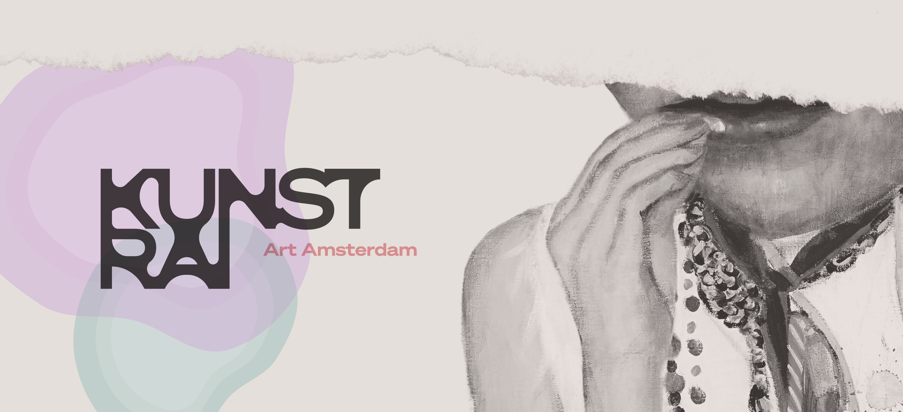
KunstRAI is an annual contemporary art fair in the Netherlands featuring modern and contemporary works across sculpture, graphic art, jewelry, painting, and mixed media.
I played a central role in shaping the project’s creative direction, leading key aspects of art direction, content design, visual design, branding, and image treatment. Through research and concept development, I helped translate the exhibition’s vision into a cohesive visual identity that balanced artistic expression with strong audience engagement.
This was a school-based group project completed over three weeks in collaboration with a four-person team, using Figma and Adobe Photoshop to design and deliver the final visual system.
Contributions
For this project, I led key stages of the creative process, including research on Neville Brody’s visual language and the KunstRAI exhibition, developing the project moodboard and branding direction, and driving concept ideation. I also spearheaded the creation of the Instagram story content and the email campaign, ensuring visual consistency and strong audience engagement across digital touchpoints.


Tina Alidaei | 2026
Takeaway
Through this project, I learned how to come up with an idea and communicate that via visual design through converging and diverging as well as a grouping. I have worked to create mood boards in the past but through this project, I learned how to create a feeling and sense to communicate the idea through the grouping of images. The project improved my art direction and visual design skills while using a mood board to keep everything on track and cohesive.
Typography
The overall goal of our type is to embrace abnormal characteristics and increase comprehension time.
Söhne Breit
We chose to use an extended version of Söhne to slow reading. The goal of our type is to embrace abnormal characteristics Sohne Breit was chosen because its extended version slows reading. We were inspired by how brody used negative space to showcase the letters, and you can see this in interaction one. The final iteration does not use negative space, but rather the letters are morphed together and reflect the shape of the blobs.
Johnstone ITC
Johnstone ITC medium is used as our body text. The overall goal of our type is to embrace abnormal characteristics and increase comprehension time. We chose Johnston ITC because its uniform stroke weight makes it readable and the diamond-shaped dot found on the i and j allows viewers to encounter an uncommon trait.
Color Palette
The pale colors dull uncomfortable visuals to prevent horror and allow art enthusiasts to appreciate unusual artwork.
Image Treatment
The images are desaturated and warmed to appear aged. The lack of true blacks softens the unnatural visuals in order to avoid repulsion to pique viewers’ interest in abnormal artwork. This also helps maintain consistent branding for artworks that come in many different colors.
Digital Assets
Website
Our first digital asset for KunstRai art event is a website. On the website transparent blobs can be seen where they set in a rhythmic manner, starting from the KunstRAI logo and revealing itself through tears in the page.
This partially-concealed element of the landing page invites the viewer to continue scrolling to reveal more. These wandering eyes may elicit an uncomfortable, but a mesmerizing feeling. eyes dart sideways and draw focus to the arrow on the right.
This horizontal scroll feature creates a continuous narrative across all pages, where blobs are laid out to push attention towards the right. In the end, visitors can be prompted to purchase tickets and see specific timeslots for entry.
Please scroll horizontally
Though mainly drawing visual attention, these artist blobs serve as an entry point to discover each individual featured artist. Ideally, these hovers would lead to a clickthrough where visitors can learn more about each artist.
Another asset is the email newsletter which provides ticket information. The email is led by intriguing pieces of art. The bottom of the email provides a prompt to purchase tickets, information about the event, scheduling, as well as social media accounts.
It mimics the identity of the website using the blobby text at the top, the grotesque artwork and transparent blobs that guide you through the email. Using the blobs there is a sense of continuity that leads you downwards in the email.
Instagram Stories
Instagram stories access a wider audience and they act as advertisements. It has a similar identity to the website's landing page and it's an animation that taps through from the first subject to the second wandering eyes.
Using concealing elements gives a sense of curiosity and the leading arrow invites the viewer to go to the next one. The stories invite you to access the website and buy tickets to the events.
We created a second story as well which uses similar elements. The advertisements in motion here. We specifically choose the eyes from the painting to give a sense of discomfort. Using piles of paper eye cutouts to draw a feeling of someone watching you. Just a reiteration/alternative to the usual motion graphic. Having less information on the stories, makes them become more mysterious.
Graphic Assets
Poster and Wristband
From here we created three graphics and three digital assets. Our first graphic asset is a poster. For the title, we took inspiration from Brody. Brody manipulated type and used negative space for the title. The title mimics this method and takes a moment to read which makes the viewer engage with the poster longer. The transparent blobs used on the poster, balance the focus from image to written information. The pastel colors give some life to otherwise creepy, duller images
Our second supporting assets are wristbands, which shift to the functional purpose. Their design hint the viewer at what the image is, but doesn’t show itself fully in order to pique some curiosity of what the art event will be about. The eye is in focus near the title, to maintain an uncomfortable feeling. These bands are color-coded to each visitor, timeslots for COVID-19 purposes
Program
Our third graphic asset is a program. The art event comes with a program that provides information on the artworks as well as the artists. The cover of the program cover is expressive, and blobs act as guiding visual elements, the color draws attention to information. Inside the program is more functional. This ‘fused’ type is seen for some headings throughout the identity, where letters are morphed together to create fresh, curvy ligatures, similar to the blob elements.
Mood board
Once our question was finalized, we gathered and grouped images to explore our ideas and insights and help expand our thinking, to further investigate our question
Following several iterations of grouping images, we described each group of images, highlighted words related to our insights, and narrowed it down into one final mood board and copy. (See image and content below)
For art enthusiasts that investigate bizarre art, this approach adopts uncommon preferences as it wavers between disgust and delight. The layered cutouts enhance grotesque visuals that evoke discomfort. Odd shapes exist in the type to sustain interest, while pale colors and aged images soften unnatural visuals in order to avoid repulsion and pique their interest in abnormal artwork.
Framing
Based on our insights from Neville Brody, we began developing the identity for KunstRAI, by iteratively generating and grouping “how might we” questions. From here we focus our design approach and framed the problem statement into one finalized question.
How might we embrace abnormal artwork to reverse conditioned behaviour?
Problem Statement
Based on our investigations and our insights that lead us to our insight we wrote this problem statement
“We intend to design an identity with peculiar characteristics to expose art enthusiasts to uncomfortable visuals in order to inspire them to appreciate abnormal preferences.”
Process
Insights
To inspire our design approach, we studied Neville Brody a graphic designer and art director. Brody was motivated by trying to reverse various behaviours or preferences that were conditioned by society.
Gathering insights from Brody helps us to encountered many interesting ideas and strategies that we could explore, however we chose one insight to focus on.
I’ve always been trying to challenge, rethink, or disrupt through graphic design. I’ve never wanted to find a comfortable place in all of this.”
Reverse behaviours and preferences conditioned by society
KunstRAI
Art Direction & Visual Design
KunstRAI is an annual contemporary art fair in the Netherlands featuring modern and contemporary works across sculpture, graphic art, jewelry, painting, and mixed media.
I played a central role in shaping the project’s creative direction, leading key aspects of art direction, content design, visual design, branding, and image treatment. Through research and concept development, I helped translate the exhibition’s vision into a cohesive visual identity that balanced artistic expression with strong audience engagement.
This was a school-based group project completed over three weeks in collaboration with a four-person team, using Figma and Adobe Photoshop to design and deliver the final visual system.
Contributions
For this project, I led key stages of the creative process, including research on Neville Brody’s visual language and the KunstRAI exhibition, developing the project moodboard and branding direction, and driving concept ideation. I also spearheaded the creation of the Instagram story content and the email campaign, ensuring visual consistency and strong audience engagement across digital touchpoints.

Tina Alidaei | 2026


Takeaway
Through this project, I learned how to come up with an idea and communicate that via visual design through converging and diverging as well as a grouping. I have worked to create mood boards in the past but through this project, I learned how to create a feeling and sense to communicate the idea through the grouping of images. The project improved my art direction and visual design skills while using a mood board to keep everything on track and cohesive.
Art Direction
Typography
The overall goal of our type is to embrace abnormal characteristics and increase comprehension time.
Söhne Breit
We chose to use an extended version of Söhne to slow reading. The goal of our type is to embrace abnormal characteristics Sohne Breit was chosen because its extended version slows reading. We were inspired by how brody used negative space to showcase the letters, and you can see this in interaction one. The final iteration does not use negative space, but rather the letters are morphed together and reflect the shape of the blobs.
Johnstone ITC
Johnstone ITC medium is used as our body text. The overall goal of our type is to embrace abnormal characteristics and increase comprehension time. We chose Johnston ITC because its uniform stroke weight makes it readable and the diamond-shaped dot found on the i and j allows viewers to encounter an uncommon trait.
Color Palette
The pale colors dull uncomfortable visuals to prevent horror and allow art enthusiasts to appreciate unusual artwork.
Image Treatment
The images are desaturated and warmed to appear aged. The lack of true blacks softens the unnatural visuals in order to avoid repulsion to pique viewers’ interest in abnormal artwork. This also helps maintain consistent branding for artworks that come in many different colors.
Digital Assets
Website
Our first digital asset for KunstRai art event is a website. On the website transparent blobs can be seen where they set in a rhythmic manner, starting from the KunstRAI logo and revealing itself through tears in the page.
This partially-concealed element of the landing page invites the viewer to continue scrolling to reveal more. These wandering eyes may elicit an uncomfortable, but a mesmerizing feeling. eyes dart sideways and draw focus to the arrow on the right.
This horizontal scroll feature creates a continuous narrative across all pages, where blobs are laid out to push attention towards the right. In the end, visitors can be prompted to purchase tickets and see specific timeslots for entry.
Please scroll horizontally
Though mainly drawing visual attention, these artist blobs serve as an entry point to discover each individual featured artist. Ideally, these hovers would lead to a clickthrough where visitors can learn more about each artist.
Another asset is the email newsletter which provides ticket information. The email is led by intriguing pieces of art. The bottom of the email provides a prompt to purchase tickets, information about the event, scheduling, as well as social media accounts.
It mimics the identity of the website using the blobby text at the top, the grotesque artwork and transparent blobs that guide you through the email. Using the blobs there is a sense of continuity that leads you downwards in the email.
Instagram Stories
Instagram stories access a wider audience and they act as advertisements. It has a similar identity to the website's landing page and it's an animation that taps through from the first subject to the second wandering eyes.
Using concealing elements gives a sense of curiosity and the leading arrow invites the viewer to go to the next one. The stories invite you to access the website and buy tickets to the events.
We created a second story as well which uses similar elements. The advertisements in motion here. We specifically choose the eyes from the painting to give a sense of discomfort. Using piles of paper eye cutouts to draw a feeling of someone watching you. Just a reiteration/alternative to the usual motion graphic. Having less information on the stories, makes them become more mysterious.
Graphic Assets
Poster and Wristband
From here we created three graphics and three digital assets. Our first graphic asset is a poster. For the title, we took inspiration from Brody. Brody manipulated type and used negative space for the title. The title mimics this method and takes a moment to read which makes the viewer engage with the poster longer. The transparent blobs used on the poster, balance the focus from image to written information. The pastel colors give some life to otherwise creepy, duller images
Our second supporting assets are wristbands, which shift to the functional purpose. Their design hint the viewer at what the image is, but doesn’t show itself fully in order to pique some curiosity of what the art event will be about. The eye is in focus near the title, to maintain an uncomfortable feeling. These bands are color-coded to each visitor, timeslots for COVID-19 purposes
Program
Our third graphic asset is a program. The art event comes with a program that provides information on the artworks as well as the artists. The cover of the program cover is expressive, and blobs act as guiding visual elements, the color draws attention to information. Inside the program is more functional. This ‘fused’ type is seen for some headings throughout the identity, where letters are morphed together to create fresh, curvy ligatures, similar to the blob elements.
Mood board
Once our question was finalized, we gathered and grouped images to explore our ideas and insights and help expand our thinking, to further investigate our question
Following several iterations of grouping images, we described each group of images, highlighted words related to our insights, and narrowed it down into one final mood board and copy. (See image and content below)
For art enthusiasts that investigate bizarre art, this approach adopts uncommon preferences as it wavers between disgust and delight. The layered cutouts enhance grotesque visuals that evoke discomfort. Odd shapes exist in the type to sustain interest, while pale colors and aged images soften unnatural visuals in order to avoid repulsion and pique their interest in abnormal artwork.
Framing
Based on our insights from Neville Brody, we began developing the identity for KunstRAI, by iteratively generating and grouping “how might we” questions. From here we focus our design approach and framed the problem statement into one finalized question.
How might we embrace abnormal artwork to reverse conditioned behaviour?
Problem Statement
Based on our investigations and our insights that lead us to our insight we wrote this problem statement
“We intend to design an identity with peculiar characteristics to expose art enthusiasts to uncomfortable visuals in order to inspire them to appreciate abnormal preferences.”
Process
Insights
To inspire our design approach, we studied Neville Brody a graphic designer and art director. Brody was motivated by trying to reverse various behaviours or preferences that were conditioned by society.
Gathering insights from Brody helps us to encountered many interesting ideas and strategies that we could explore, however we chose one insight to focus on.
I’ve always been trying to challenge, rethink, or disrupt through graphic design. I’ve never wanted to find a comfortable place in all of this.”
Reverse behaviours and preferences conditioned by society
KunstRAI
Art Direction & Visual Design
KunstRAI is an annual contemporary art fair in the Netherlands featuring modern and contemporary works across sculpture, graphic art, jewelry, painting, and mixed media.
I played a central role in shaping the project’s creative direction, leading key aspects of art direction, content design, visual design, branding, and image treatment. Through research and concept development, I helped translate the exhibition’s vision into a cohesive visual identity that balanced artistic expression with strong audience engagement.
This was a school-based group project completed over three weeks in collaboration with a four-person team, using Figma and Adobe Photoshop to design and deliver the final visual system.
Contributions
For this project, I led key stages of the creative process, including research on Neville Brody’s visual language and the KunstRAI exhibition, developing the project moodboard and branding direction, and driving concept ideation. I also spearheaded the creation of the Instagram story content and the email campaign, ensuring visual consistency and strong audience engagement across digital touchpoints.